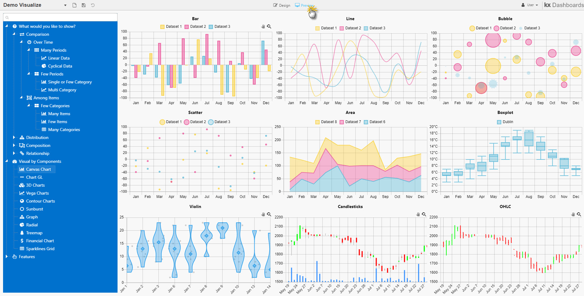
Workspace
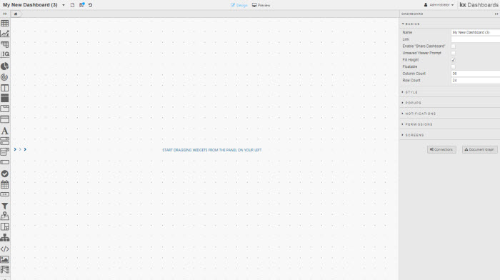
The Workspace is comprised of three sections:
- on the left is a component listing
- in the center is the canvas where components are added and arranged
- to the right are the properties associated with the selected component or dashboard
The user menu displays your user name in the top right. Here you can pick a theme, timezone, log level and the base language for the dashboard: English, German or Japanese.
Dashboard theme
The Dashboard Builder theme is independent of the dashboard style. Pick the dashboard theme from the dashboard’s Style menu.
Menu Bar
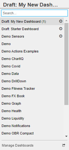
Document List
A list of available dashboards. Draft dashboards are marked as 'Draft' and are not available to users in Viewer.
Dashboard Manager
Dashboard Manager is available at the end of the Document List:
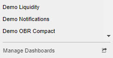
Clicking the  will open the Manage menu.
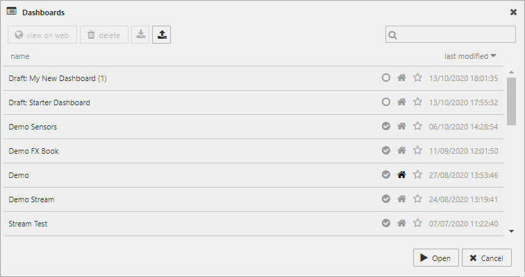
Select a dashboard, then choose from:
- Open
- Opens a Dashboard for editing.
- View on web
- Opens the Viewer (end-user) version of your dashboard.
- Delete
- Deletes selected dashboard.
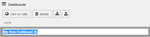
Rename Dashboards
To rename a dashboard, click on the dashboard name in the manager listing to activate renaming.
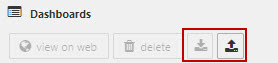
Importing and exporting dashboards
Dashboards can be exported and imported in a file format.
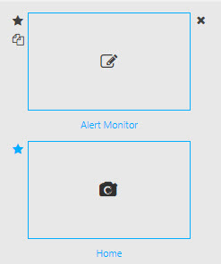
Manager Icons
| icon | description |
|---|---|
| Uncheck to make a draft dashboard; draft dashboards do not appear in the Viewer dashboard listing. | |
| Click the Home icon to select the dashboard to open when dashboards starts. | |
| Click the star icon to make a dashboard a favorite; favorite dashboards are prioritized in the dashboard listing. |
Toolbar
A set of buttons are found to the right of the dashboard dropdown selector in the header bar:
| button | function |
|---|---|
 |
New dashboard |
 |
Save dashboard. |
 |
Undo Icon |
 |
Redo Icon |
 |
Share Dashboard Link; available in quickview |
 |
Export as PDF |
| button | function |
|---|---|
|
New dashboard |
|
Save dashboard. |
|
Undo Icon |
|
Redo Icon |
|
Share Dashboard Link; available in quickview |
To export a dashboard as a file, long click on the

Long click on the to reverse actions beyond the most recent event.
Preview Toggle
When building dashboards, use the Preview button  to interact with your dashboard. Preview Mode offers the same level of interactivity as would be experienced by the end user, allowing you to test the functionality of your dashboard.
User Menu
Configuration options for the Dashboard Editor
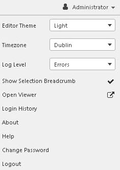
- Editor Theme
- Switch between
LightandDarktheme for the Editor. This does not change the theme for the dashboard which is defined in the Style menu. - Timezone
- Switch the display of kdb+ type
datetimeandtimestampto selected Timezone. This doesn't change display of time duration, e.g. kdb+ typetime. - Log Level
- Switch between
None,Errors,Handled/Warnings,Logs & Debugs, orAll. - Show Selection Breadcrumb
-
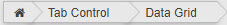
Display root structure for components, including nested components on selection. Components can be selected from the Breadcrumb.
- Open Viewer
- Open the dashboard in a new tab as it would appear and function to the end user.
- Login History
- A pop-up of user login success or failure by date, and user location.
- About
- Display copyright information and version of dashboards installed.
- Help
- Opens online help documentation.
- Change Password
- Allows user to change their password.
- Logout
- Log out of current dashboard session.
Component listing
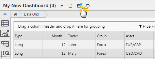
Add components by click-and-drag into the workspace, e.g. Data Grid.
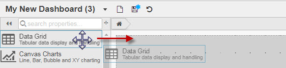
Central canvas
Arrange and resize components on the central canvas by dragging the resize handles on the edges.
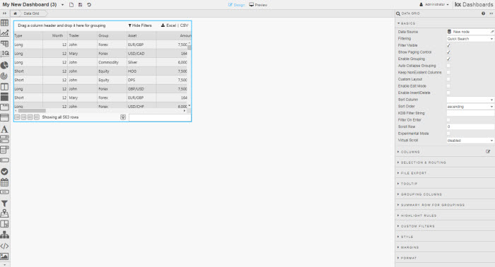
A simple dashboard
Component properties
Selecting a dashboard component displays its properties on the right.
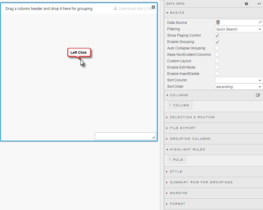
A new Data Grid, with its properties displayed
Properties vary from component to component, but almost all have a Data Source.
Dashboard properties
Property Search
Search for a property within a selected component.
Basics
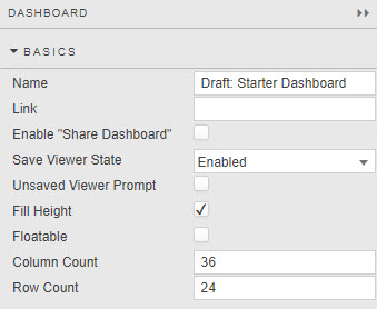
- Name
- A name for the dashboard.
- Link
- The URL for sharing access to the dashboard. (The link is not editable. Clicking on it will open the dashboard in a new browser tab.)
- Enable "Share Dashboard"
- Adds a share icon to generate a link which stores the viewed states (e.g. pivot drill down position) which can be shared with others.
- Save Viewer State
- Defines how view states are used.
| view state | description |
|---|---|
| Enabled | When a User saves their dashboard, the current value of any view states in the dashboard are saved and used the next time the dashboard is loaded. |
| Disabled | User defined view state values are not stored on dashboard save. Each load of a dashboard is treated as a new instance with respect to view states; default values are used |
| Enabled (Autosave) | Changes in view state values are automatically saved on change. Values are stored and used the next time the dashboard is loaded. |
- Unsaved Viewer Prompt
-
When checked, user will be prompted on any unsaved changes before switching to another dashboard.
- Fill height
- When checked, the dashboard fills the height of the browser. (Dashboards always fill the browser width.)
Row height
If Fill Height is disabled, Row Count becomes Row Height; Row Height is the height, in pixels, between each grid row. The number of grid rows used is defined by the prior Row Count value; e.g. if Row Count is 30 and Row Height is set to 30; then the distance from top to bottom - in the absence of Fill Height is 900 pixels. If the pixel height is greater than the browser height, a scroll bar will appear. In addition, some components may be positioned off-screen.
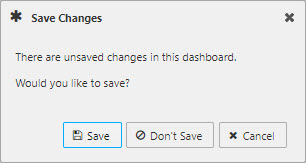
Save your dashboard frequently
To prevent loss of work from server time outs, save your dashboard on a regular basis.
- Floatable
- Column Count
- Row Count / Row Height
- See Layout Panel for further details
Style
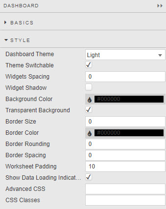
- Dashboard Theme
- Theme Switchable
- Sets Light or Dark theme for dashboard and define if theme can be switched. This should be disabled (theme-locked) if the dashboard uses custom styling which would not update on global theme switch.
- Widgets Spacing
- Widget Shadow
- Define distance in pixels between components and add optional shadow.
- Background Color
- Transparent Background
- Define background color of components.
- Border Size
- Border Color
- Border Rounding
- Border Spacing
- Define border criteria of components.
- Show Loading Indicators
- When checked, indicates when dashboard is loading data. If your dashboard uses streaming, managed or polling data, leave this unchecked.
Style for common style properties
Popups
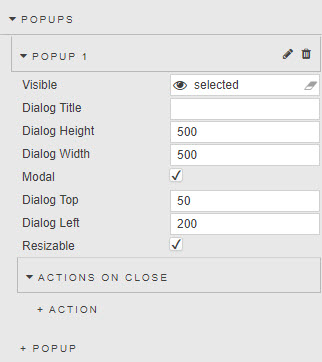
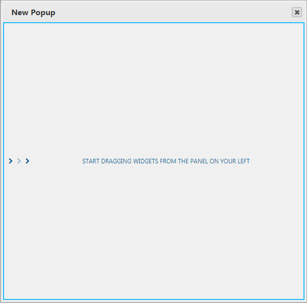
Create a popup then edit to add content into the popup element.
- Visible
- Assign a boolean viewstate. The viewstate can be triggered by an Action. If no view state assigned and box checked, popup will appear when the dashboard loads.
- Dialog Title
- Header name of popup.
- Dialog Height
- Dialog Width
- Dimension area of popup in pixels.
- Modal
- Make Popup modal.
- Dialog Top
- Diallog Left
- The position of the popup is measured in pixels from top and/or left of screen. If not set, popup will appear in the middle of the screen.
- Resizable
- Allow user resizing of popup window.
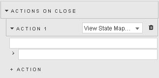
Actions on Close
A series of view state parameters values can be mapped when the pop-up dialog is closed.
Notifications
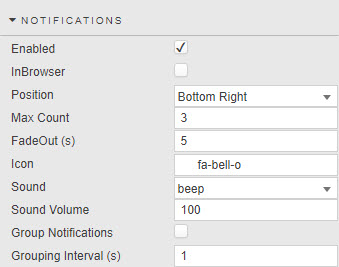
- Enabled
- Notification messages, e.g. a failed login attempt, will appear on screen.
- In Browser
-
When enabled, notification will be forced to display in the browser, location set by Position. Native notifications will trigger when disabled.
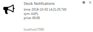 native notification
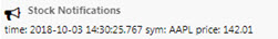 browser notification
 - Position
- Location of notification message, select from:
Top Left,Top Center,Top Right,Center Left,Center Right,Bottom Left,Bottom Center,Bottom Right. - Max Count
- Maximum number of messages displayed at any one time.
- FadeOut (s)
- Length of time in seconds notification remains on screen.
- Icon
- Select from
bell-o,flag-o,bullhorn,clock-o,comment-o,commenting-o,exclamation-circle,exclamation-triangle,noneif an icon is required as part of the notification. - Sound
- Select from
beep,beepbeep,noneif an aural notification is required. - Grouping
- Enable Group Notifications for notifications to be grouped as a single message within an interval defined by Grouping Interval defined in seconds.
Set Trigger
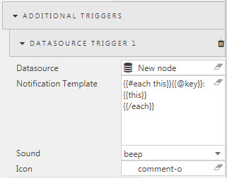 .
.
- Datasource
- Defines the conditions for the trigger. The data source has to use streaming, managed or polling data.
- An example query for notifications; set Subscription to polling and keyed to
timefor every 20 seconds.
share: `AAPL`GOOG;

t: `time xasc ([] time:.z.Z ; sym:1000?`AAPL`GOOG; price:50+ (floor (1000?100.99)*100)%100)
Enable Browser Notifications
If prompted, enable browser notifications for the pop-up to appear.
- Notification Template
- This determines the information displayed in the notification popup.
- Sound
- What sound to associate with the defined trigger.
- Icon
- What icon to associate with defined trigger.
Configure browser to allow popups
For popups to appear in the browser it may be necessary to change browser settings to allow popups in addition to building the required configurations in your dashboard. A valid SSL certificate is required for in browser notifications.
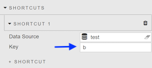
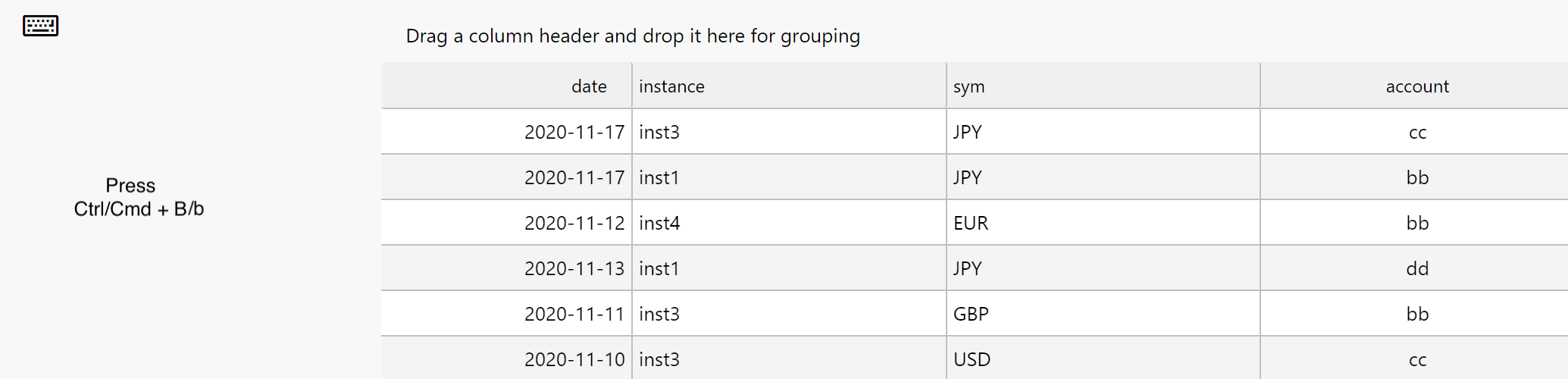
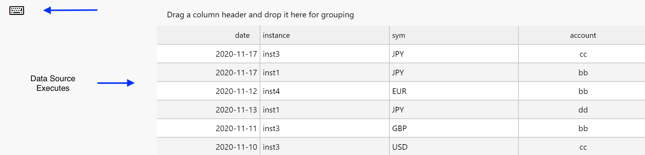
Shortcuts
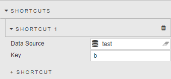
- Data Source
- Key
-
A keyboard key that will assigned to the data source and execute when pressed.
Browser Shortcuts
The key map component does not override any of the browser shortcuts in the browser being used. This means other keys must be used for the key map component.
Some of the existing browsers shortcuts can be found below.
| shortcut | result |
|---|---|
| Ctrl + N | New window |
| Ctrl + T | New tab |
| Ctrl + H | Open history |
| Ctrl + J | Open downloads |
| Ctrl + G | Next match in Find Bar search |
| Ctrl + P | Print options |
| Ctrl + S | Save options |
| Ctrl + U | Display uneditable HTML source code |
| Ctrl + D | Bookmark current page |
| Ctrl + I | Page info |
Key Shortcut Override
Dashboard key maps do not change existing browser shortcuts
Permissions
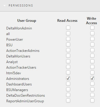
Permissions are granted to groups of users, as defined in KX Control.
Read Access is permission to view the dashboard; Write Access is permission to edit it.
Screens
Each dashboard has a main screen; other screens can be added and linked using the Button component.
| button | action |
|---|---|
 |
Delete screen |
 |
Duplicate screen |
 |
Set screen as default on dashboard load |
 |
Edit screen |
 |
Take snapshot image of screen: used by Navigation Component tooltip |
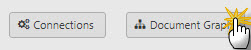
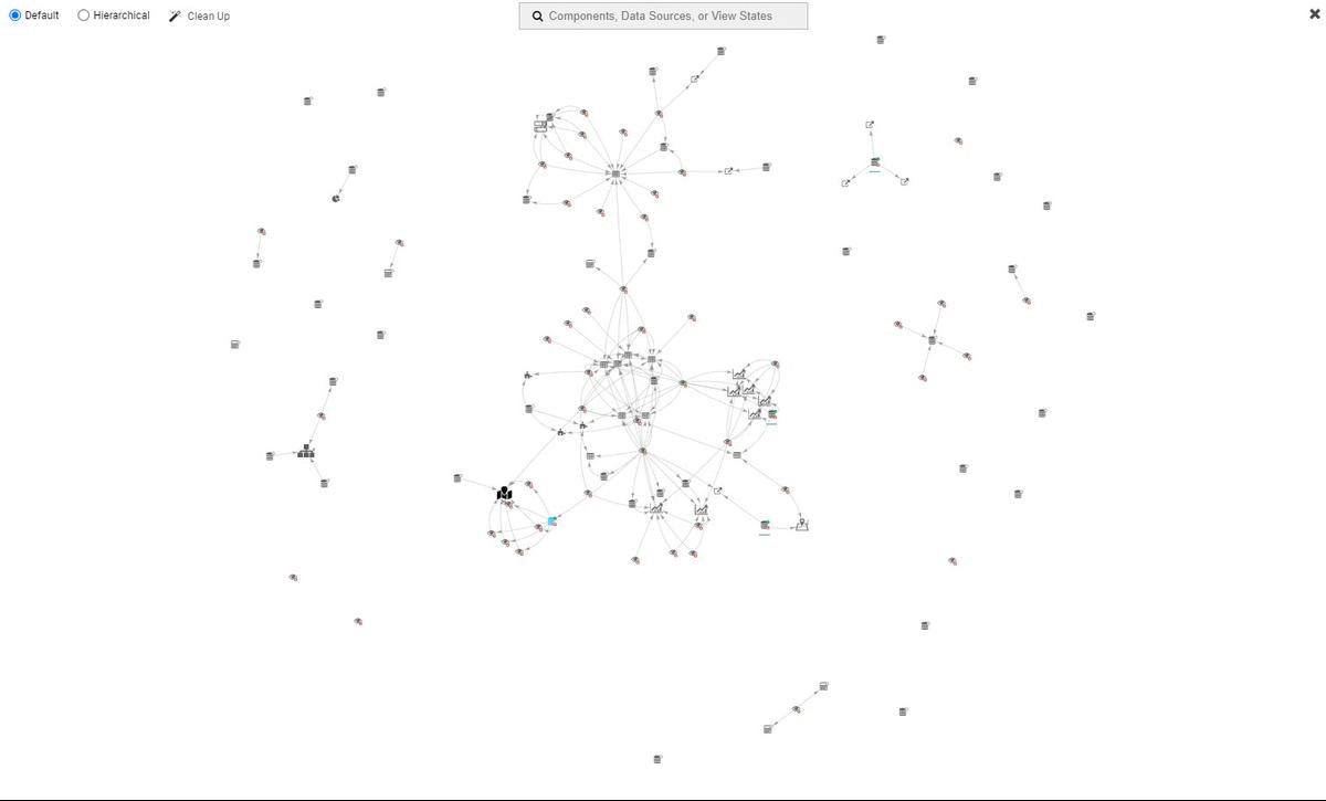
Document Graph
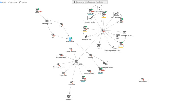
Display relationships between components, data sources and view states for the underlying dashboard. Selecting a data source or view state in the Document Graph will open the appropriate editor.
Clean up removes redundant data sources and view states.
Searching for a data source or view state will show all related interactions for the searched item in the Document graph.
Linking components
Components with a common Data Source can be linked so that changes to one are reflected in the other.
Queries using input variables can have values passed to them using Data Form or Drop Down List components.
Keyboard shortcuts
Dashboards support keyboard shortcuts
| shortcut | result |
|---|---|
| Ctrl + C | Copy component |
| Ctrl + V | Paste component |
| Ctrl + O | Open manage dashboard dialog |
| Ctrl + S | Save dashboard |
| Ctrl + X | Cut component |
| Ctrl + Z | Undo feature |
| Ctrl + Y | Redo feature |
| F1 | Show help documentation for selected component |
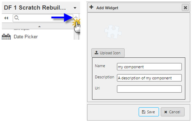
Custom component
This is for Dashboards component developers, who will need the Software Development Kit and documentation of the API; contact your First Derivatives representative for more information.
Once your Javascript component is built, add it into Dashboards: