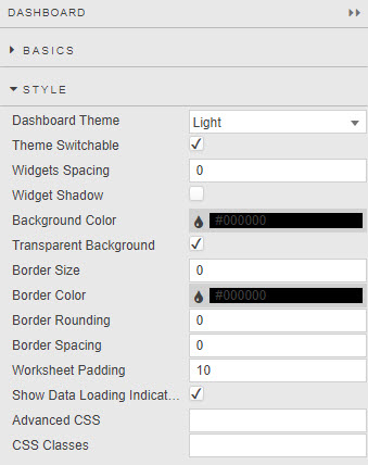
Style
Dashboard style
Global dashboard settings which are applied to all components in a dashboard
Global Change Overwrite
Changes made using the global Style menu of dashboards will overwrite any individual changes at the component level.
- Dashboard Theme
- Light or Dark
- Widgets Spacing
- Margin in pixels around each component
- Widget Shadow
- When checked, applies a drop shadow to each component
- Background Color
- Defines background color of all widgets in the workspace unless overwritten by widget own style.
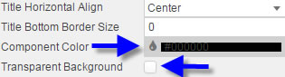
- Transparent Background
- If the property is checked, the Background Color property is ignored and set to transparent.
- Border Size, Border Color, Border Rounding and Border Spacing
- Defines the border applied to components. To apply a border, set Border Size to a value greater than 1. Border Spacing sets the distance between the border and the inner component.
- Worksheet Padding
- Padding in pixels around each component
- Show Loading Indicators
- When dashboard sends a request for data, a spiral "loading" indicator appears on screen until data is uploaded.
-
Show Loading Indicators
If your dashboard uses streaming, managed or polling data, uncheck Show Loading Indicators.
Logo
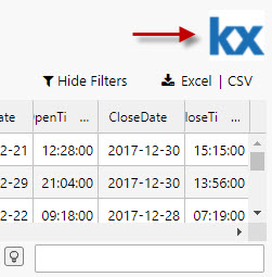
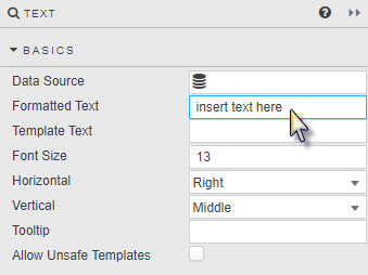
A simple image logo can be added to a dashboard using a Text Input component.
-
Drag the Text Input component into the dashboard, then select it.
-
Click inside the Formatted Text box of the Basics properties to open the editor.
-
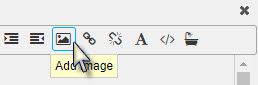
Use the menu bar to add an image.
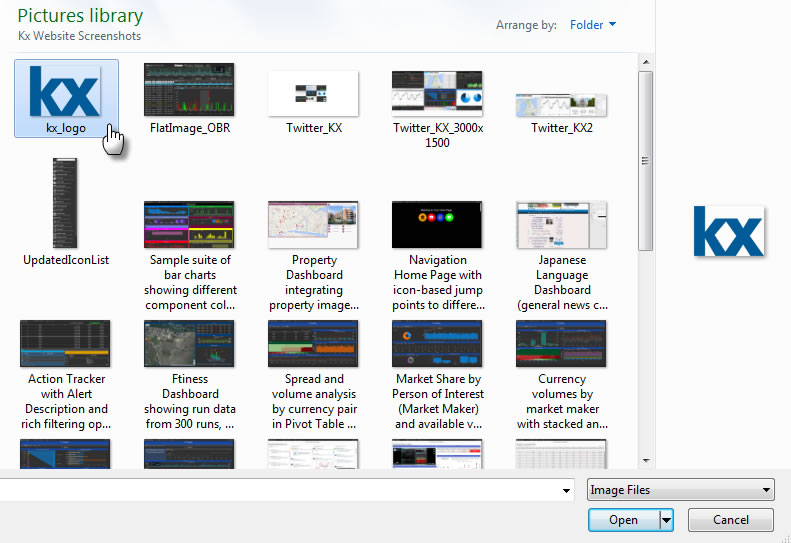
Ensure your logo image uses a transparent background – to be compatible with the background of the dashboard.
-
Set the height and width of the logo in pixels.
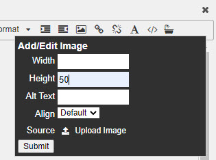
50 pixels is a good height for a logo. The importer will re-scale the logo maintaining its aspect ratio if only the image height is set.
-
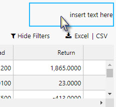
Delete the default
insert text herebefore adding the logo. -
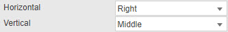
If your logo is positioned to the left of the dashboard, change the Horizontal alignment to Left. (Vice versa for right-positioned logos.)
-
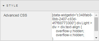
Prevent the appearance of unnecessary scroll bars around the logo on browser resize: update Advanced CSS from the Style menu.
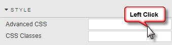
-
Click the CSS icon to activate the selector.
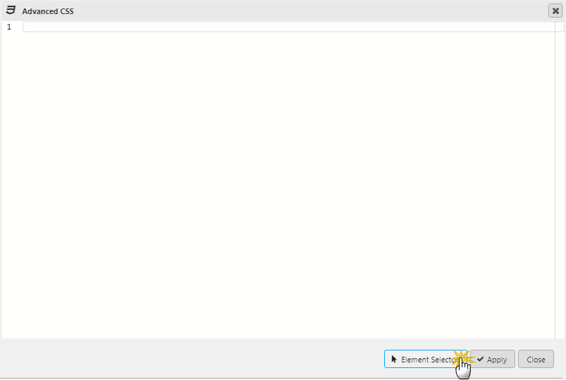
-
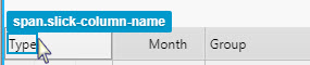
Roll over the component until the
div.htmlContentbox is selected: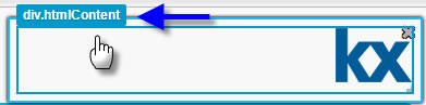
-
Amend the CSS to hide scroll bars: set the
overflowproperty tohidden. (Remember to add the CSS inside the{}brackets.)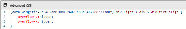
-
Tip
If dashboard styling is used to align and position components, remember to update the Margins setting of the Text Input component to undo any unnecessary changes to the position of the logo.
Component style
Some style settings common to many components
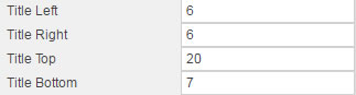
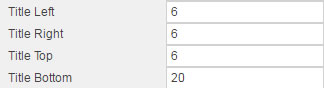
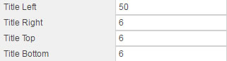
Title
Controls title positioning relative to the component pane and outer border
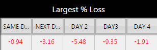
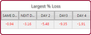
| Sample title settings | Results |
|---|---|
 |
 |
 |
 |
 |
 |
Adjusting Title Left and Title Right will add margin even if the title is center-aligned by Title Horizontal Align in the Format dialog.
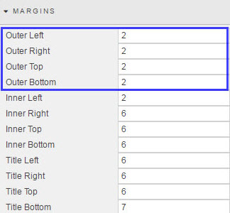
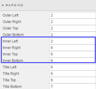
Margins
- Outer margins
-
Spacing in pixels outside of component and component border
- Inner margins
- Spacing in pixels between the rectangular component area and any utilized border.
Tip
In the absence of a defined border, changes between inner and outer margins will appear similar.
Added widget spacing is the equivalent of outer margins in the Margins menu of a component
Border Spacing sets the spacing between the elements of the component and the border.
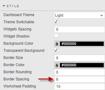
Border Spacing is the the equivalent of inner margins in the Margins menu of a component.
Rounding of borders is possible only if Border Size has a value greater than 1. Use of more rounded borders requires increased border spacing to avoiding edge cutting of the border.
Dashboard and component margins
Dashboard margin settings override component margin settings. When styling dashboards, set margins at the dashboard level before setting them for individual components.
Format
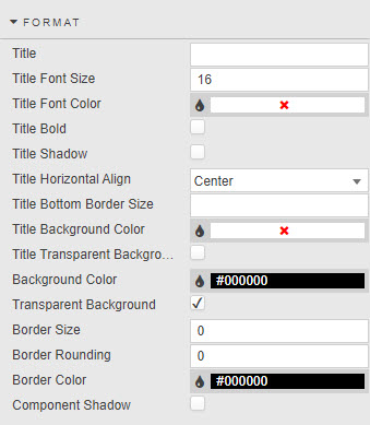
- Title
- Title Font Size
- In pixels
- Title Font Color
-
Click on the color bar to bring up the palette menu
- Title Bold
- Title Shadow
- When checked, applies shadow to the title
- Title Horizontal Align
- Horizontal position of the title within component
- Title Bottom Border Size
-
Pixel distance between the title and the component content
- Border and background color
-
Component Color is the color of the component’s border and title background when Transparent Background is unchecked
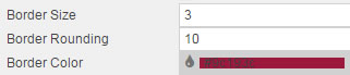
- Border Size, Rounding and Color
-
These three parameters control the borders of a component:
Inner margins
Adjust Inner Top and Inner Bottom margins if necessary to avoid the rectangular box of the component cutting into a rounded border.
- Component Shadow
 A Bar Chart with a component shadow
ChartBarColors
Color order for a pivot query. In the absence of a pivot query, the assignment of the colors is done in the order of the Data.
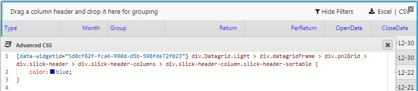
Advanced CSS
Click inside the Advanced CSS editor. Click the selector icon, then inside the chart component to edit CSS rules.
-
Click inside the Advanced CSS editor
-
Click the Element selector.
-
Use the selector to point at the area of the component to change. The editor will automatically detect and assign the relevant widget ID and reference CSS - all that’s needed is the custom content, e.g. color, background-color etc.
-
Apply the changes
Finding the Widget ID
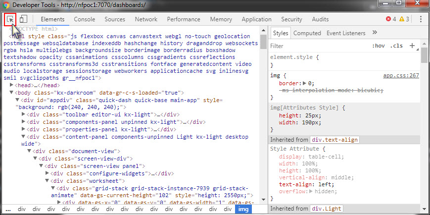
Any Advanced CSS component can be used to define the CSS for any component in a dashboard, all that's required is the correct Widget ID. Use Chrome Developer Tools, Elements Inspector to source the Widget ID. Select an element with the Developer Tool pointer directing it on the component in the Dashboard. This will focus the Elements content on the component HTML. Associated CSS will be displayed in the right column and widget ID in the main pane.
Customizing Error Messages
Error messages defined by cssClass:"..": can be styled in the Advanced CSS editor; for example:
'"cssClass:\"criticalError\":Invalid parameter!"would use the CSS format
[data-widgetid="widgetIdGuid"] .criticalError .statusText {
    font-size: 60px;
    color: red !important;
}
in the Advanced CSS editor.
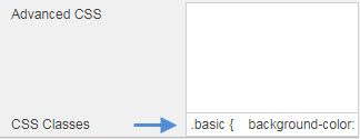
CSS classes
CSS classes can be used to style components. CSS classes can be created directly or assigned to a view state parameter.