Selection Controls
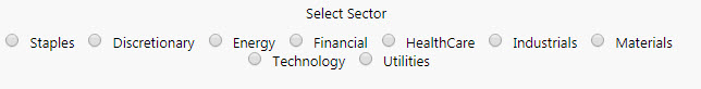
Some Radio Buttons
Set up
-
Use a data source to define the items in the selection control.
-
Define in the mapping which column represents the text labels in the selection control, and which column is the value passed to the view state on selection.
-
Set the Selected Value as a view state parameter which carries the value of the selected item.
Basics
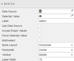
- Data Source
-
A data source: include the list of values to pass into the linked View State Parameter and possibly a list of value names to display in the dropdown. For example:
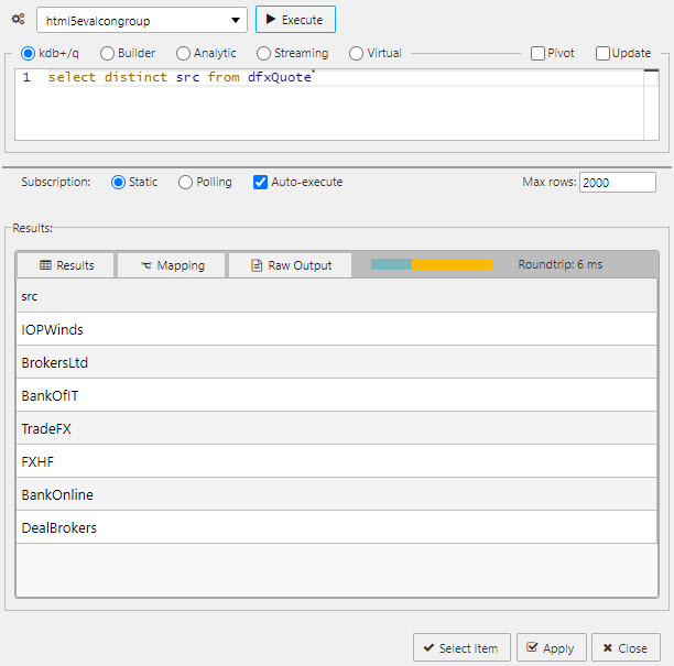
A query for a Radio Button data sourceTip
When using Data Source to create a set of radio buttons, ensure Use Data Source is checked and Data Source Mapping is defined.
-
A sample query to use is (if connecting to the sample data connection source
htmlevalcongroupavailable in the sample demo dashboard set):select distinct src from dfxQuote - Selected Value
-
The view state parameter populated on selection.
- Label
- Label description for the Radio Button
- Use Data Source
- When checked, Data Source is used to build a Radio Button
- Accept Empty Values
- When checked, a null value is available for selection
- Force Selected Value
- When checked, the Radio Button will always populate a Selected Value View State Parameter; either default or selected value (which may be null if not set).
- Multi-select
-
When checked, multiple radio button selections are supported and selected items passed to the Selected Value View State Parameter.

- Items Layout
- Configure Radio Button layout:
HorizontalorVertical - Horizontal
- Radio button alignment:
Left,RightorCenter - Vertical
- Radio button alignment:
Top,MiddleorBottom - Label Width
- Width of the main label
Data source mapping
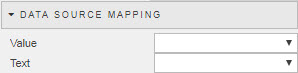
When a Data Source is used to populate Radio Buttons, the items of the Data Source will represent values. Labels must be assigned using Data Source Mapping – else the list will be empty.
- Value
- The column of the Data Source corresponding to the values to be passed into the Selected Value View State Parameter
- Text
- The column of the Data Source corresponding to the text to be displayed as the dropdown options
Items
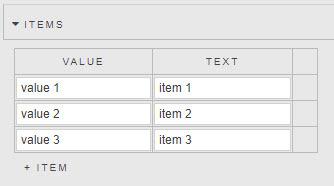
If Data Source is not used to create Radio Buttons, individual values can be specified in the Items menu.
Action
Style
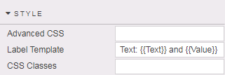
Template
-
Sets the label text for each selection item. The parameters passed to the template depend on whether Use Data Source is enabled.
- if using a data source then the parameters reflect the column names
- if inputting items manually then Text and Value parameters are passed
Format, Margins
Style for common settings