Date Picker
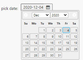
Assigns a date input to a View State Parameter
The Date Picker will highlight dates found in the Data Source
Using DateTime?
For time data of type Datetime, use the Data Form component for nanosecond support.
Set up
- Set data source with
Datedata
Basics
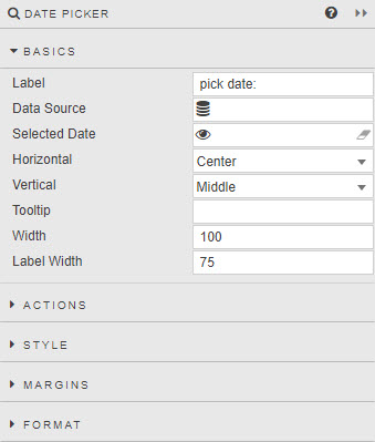
- Label
- Descriptive label
- Data Source
-
Data sources Optionally set a list of valid dates that can be chosen by the user
DateDataOnly kdb
Datetype data can be assigned to a Date Picker - Selected Date
- A View State Parameter of type Date
- Horizontal
- Horizontal alignment (left, center or right) of date selector inside the component boundaries
- Vertical
- Vertical alignment (top, middle, bottom) of date selector inside the component boundaries
- Tooltip
- Text description which appears when user mouses over the Date Picker
- Width
- Pixel width of dropdown
- Label Width
-
Pixel width of dropdown Label
Tip
If assigned Label Width is narrower than the Label description, text in the Label will wrap.
Action
Style
Style for common settings