Visual Inspector
The Visual Inspector allows the user to visualize data contained in lists, tables or dictionaries in the following formats:
- Table
- Histogram
- Heatmap
- Scatterplot
- Bar
- Horizontal Bar
- Line
In contrast to the scripted visuals, the Visual Inspector provides a GUI with a point-and-click style interface to visualizing data. Because of this, the visualization styles are more limited than their scripted counterparts, but require no manual coding.
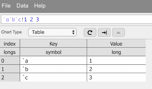
 Default table view
Visualizing data
The Visual Inspector has been designed to provide options for inspecting and visualizing data. Though various views are available, the default view in the Visual Inspector is a paged Table. With this view, any amount of data can be viewed a page at a time. By default, a page displays 250 records of the table. Navigation between pages is simple, and is discussed in the section below.
Options for visually displaying data are also available. Most visuals offer an option for binning the data before rendering the desired visual. This means that data points in a table can be grouped into a specified number of bins on each axis of the visual. For example, binning any number of records in a scatterplot using 20 bins for both the X- and Y-axes will yield a 20*20 grid of points, thus only rendering 400 total points. Binning is a useful visualization strategy, especially for very large data sets where the amount of data to be rendered may vastly exceed the screen resolution, hence many points will ultimately map to the same pixel anyway. Note that by default, binning is disabled, and must manually be enabled if desired.
Opening a new inspector
The inspector can be opened by picking Tools > Visual Inspector from the main view in Analyst.
Opening on an expression
The Visual Inspector can also be invoked from the Analyst IDE by selecting any q expression and performing one of the following operations:
- Pick Inspect from the Q menu
- Right-click and pick Inspect from the context menu
- Press Ctrl+I in Windows/Linux or ⌘I in macOS on the keyboard as a shortcut
The IDE will then execute the q expression that had been selected, and will present a default Table view of the result in a new window.
The Visual Inspector can also be opened within the main Analyst tab rather than a new window by pressing the related hotkey Ctrl+Shift+I in Windows/Linux or ⇧⌘I in macOS, as shown below.
Entering queries into the inspector
Once the Visual Inspector is open, you can enter q queries directly into the query input line. In the example below, the user has entered a standard q-SQL query. When the query returns, information about the returned data is shown above the table. In addition, column types and attributes are shown under each column name.
By entering a query into the query bar and clicking Enter, the query is run within the q process, obtaining new data. However, when clicking Update Graph (refresh button), the query is only run if it had not previously been run. Otherwise, the previously returned data is used. This is useful for assigning new aesthetic mappings without causing the underlying data to change.
Query type resolutions
Not all queries resolve to a two- or multi-column table. For example, a dictionary may only have a single column with a set of values; a list may contain a simple set of numbers. In such cases, the Visual Inspector will try to find a satisfactory rendering of the query.
Data brushing
Certain chart types provide data brushing: left-click on certain parts of the chart.
If the visual is binned (the number of records are greater than or equal to the threshold), the X and Y ranges of the bin will be provided in a tooltip along with the number of records within the bin. If unbinned, a tooltip will appear with the information of the specific record clicked.
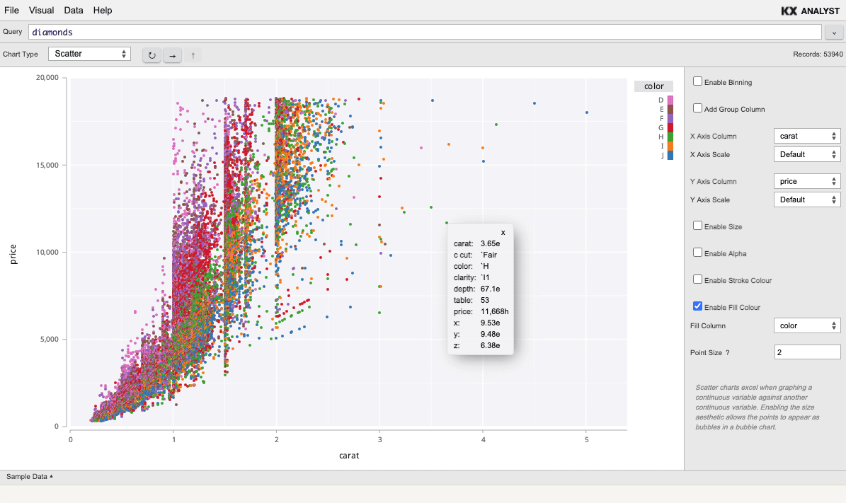 Tooltips appear when clicking a point
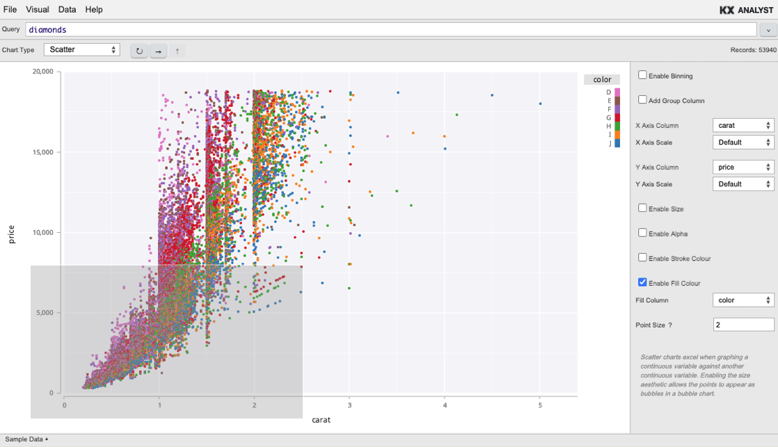
Data zooming
Several chart types allow zooming into a visual to render a new visual of the specified area of the original visualization.
To zoom into an area of a chart:
- Move your cursor over the graph
- Press and hold Ctrl or Alt on Windows/Linux, or ⌘ on macOS
- Left-click the mouse and hold
- Drag the cursor to another location
- Release the mouse button
In the following images, a user has dragged a rectangle over a portion of the top image. When the user releases her mouse button, a new image will render with an enlarged view of the selected region. When the new image is created, an up arrow will be placed in the top right corner. Clicking this arrow will generate the original visual before the zoom occurred. This process can be repeated to zoom further and further into the data.
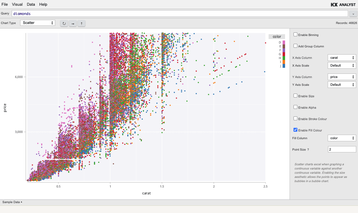
Also, the plot type can be switched to any other visual that supports zooming (see above). After switching the plot type, pressing the right-arrow button will refresh the visual, maintaining the current zoom level.
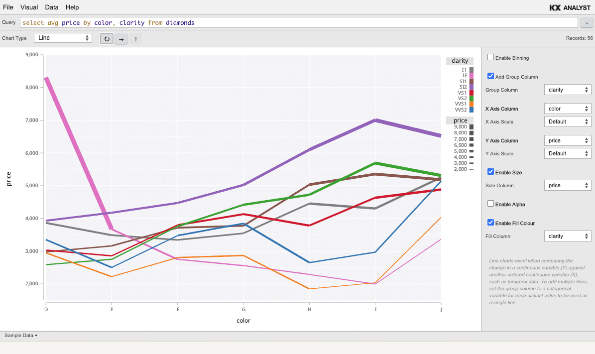
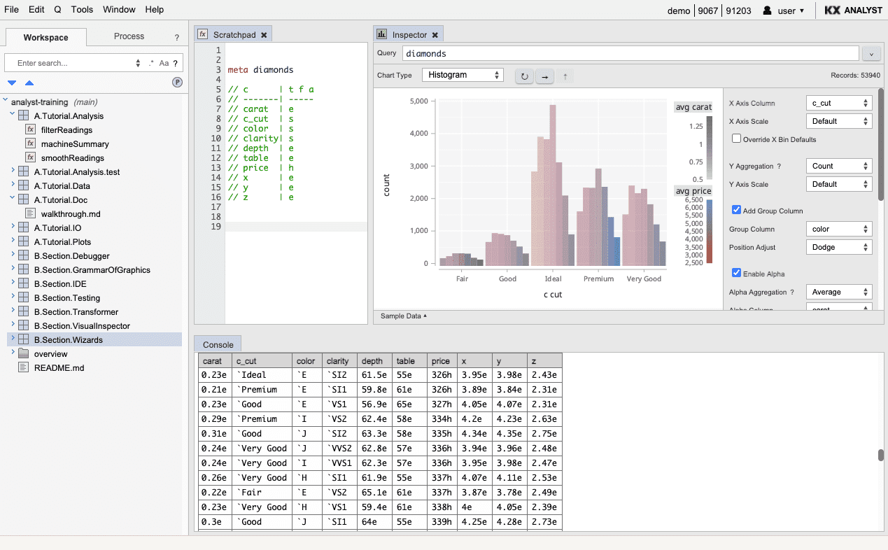
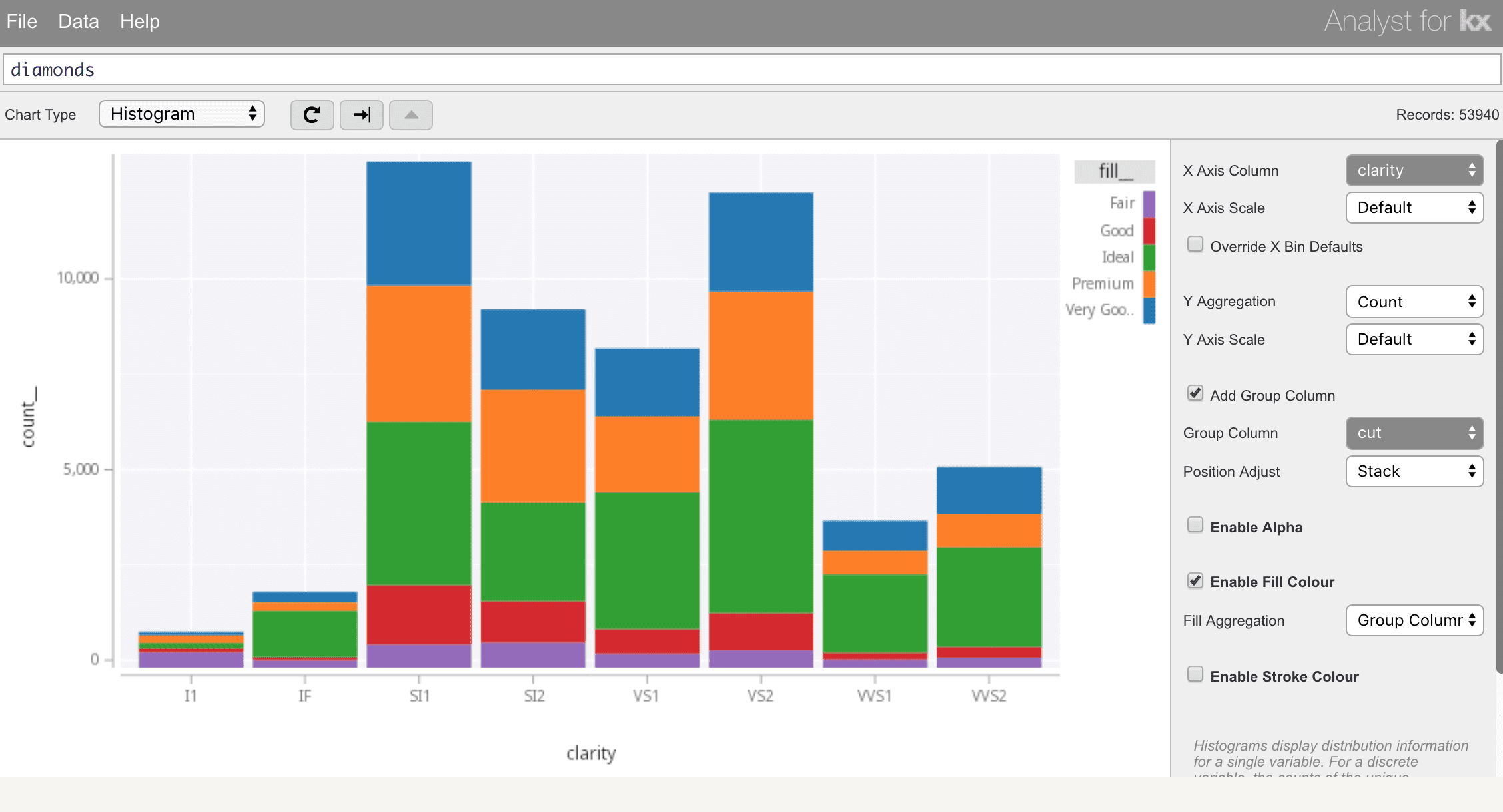
Series data/group columns
Several chart types allow a group column to be chosen. Choosing a group column will render one layer per group variable. Where this is supported, the group column can be mapped to an aesthetic to differentiate the layers.
For example, in a scatter, choose a group column and then select the group column as the fill-colour aesthetic. This would render each individual group in a separate colour, and would draw a legend indicating the colour mappings. This allows records associated with each distinct column value to be compared against each other in a single visualization.
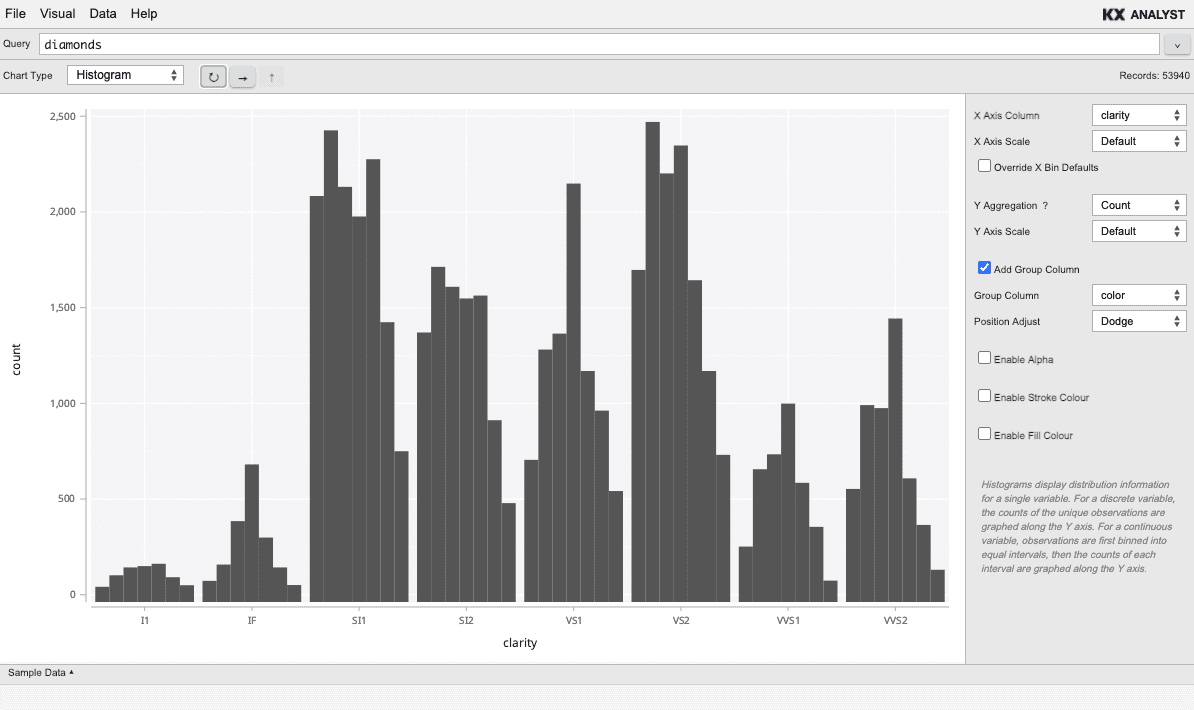 Grouped Columns with dodge adjust and no aesthetic
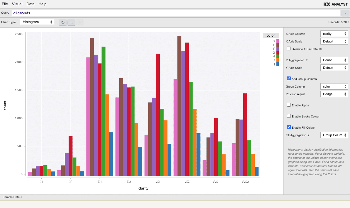 Grouped Column with dodge and fill aesthetic
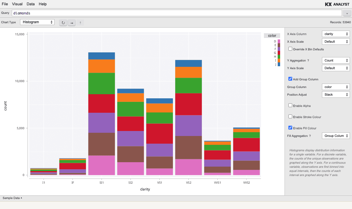 Grouped Columns with stack adjust and fill aesthetic
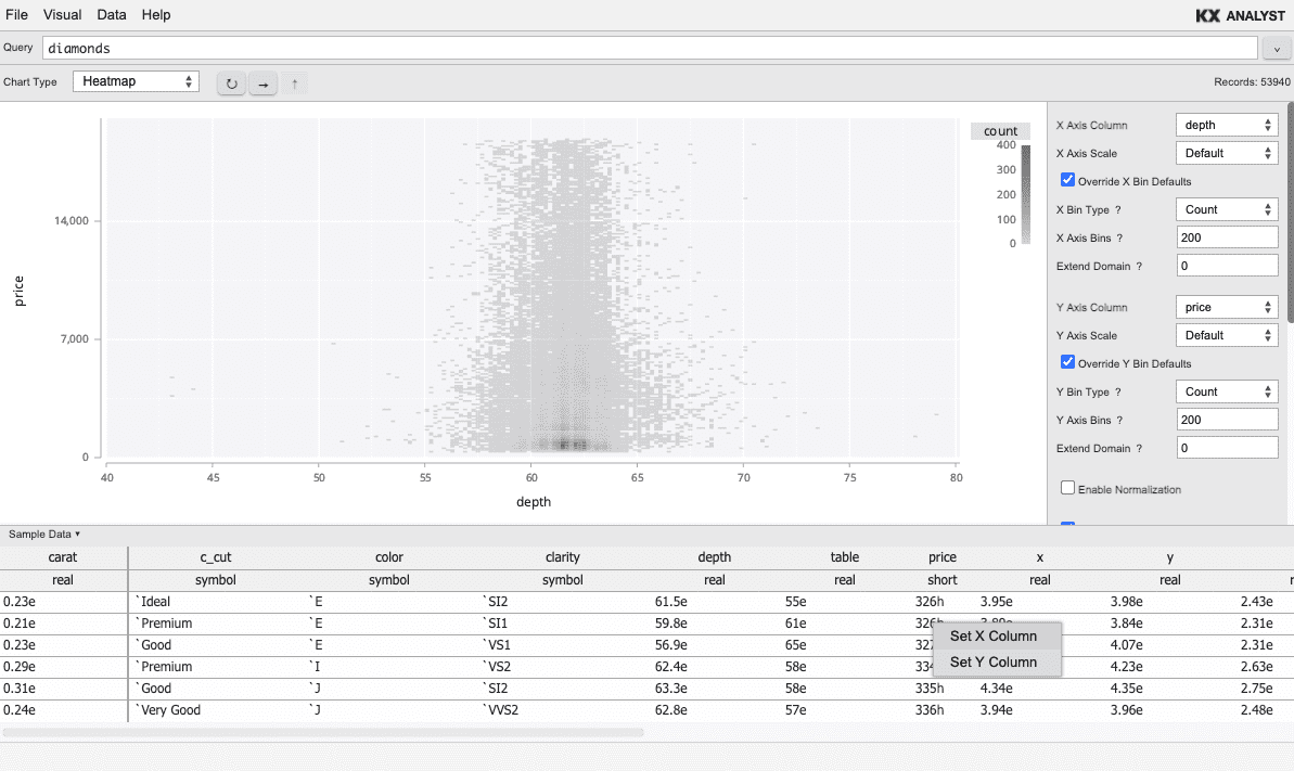
Summary data
In all visual plot types (excluding the Table view), a panel containing sample data can be expanded to give a quick overview of the data schema and values. The sample data can be expanded or collapsed by clicking the bar titled Sample Data.
Additionally, from this sample view, the X and Y axis columns can be set for
the current visual using the context menu on the sample grid as a convenience.
Saving visuals
To save a visual, choose Save or Save As from the File menu. The visuals are saved under a module within Analyst and can be pushed to and from repositories. To open a saved visual, simply double-click the visual from within the Search Pane.
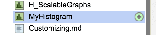
A saved visual for many of the chart types (excluding Table)
also acts as a function that can be executed. For example, with
the above saved visual named MyHistogram, executing the saved visual
from a q file as in:
.qp.go[500;500] MyHistogram[]
will render the histogram within Analyst. Further, a specific table can be passed to the saved visual to overwrite the query saved in the UI as in the following:
.qp.go[500;500] MyHistogram select from table where a > b
Chart types
Many chart types are available in the Visual Inspector. Each available chart is outlined here along with a description of the attributes associated with each.
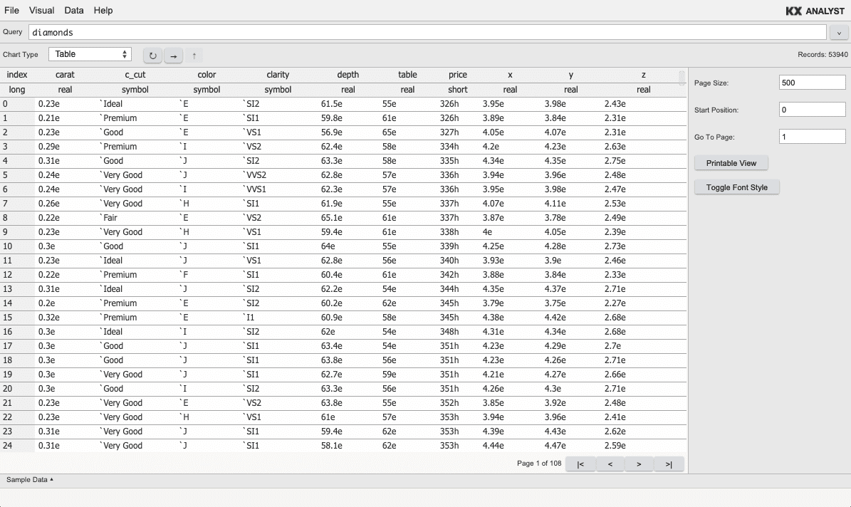
Table
The default chart in the Visual Inspector is a conventional table of rows and columns. This chart provides a paged display of a table allowing, e.g., the inspection of very large tables quickly. By default, 250 records of the table are displayed per page. This means that once the Visual Inspector is opened on a table, all records in the table between index 0 and 250 will be visible. Navigating through the pages is simple with the Page Navigation controls, allowing quick navigation to the first and last page, as well as stepping through the table page by page.
The Page Navigation buttons in the Chart Properties panel allow the table to be paged to the first page, back one page, forward one page, and to the last page.
At any point, a cell can be double-clicked to drill into the data contained in the cell. This can be repeated to drill further and further into data. At any point, a drill operation can be undone by clicking the Drilldown Navigation up-arrow button in the Chart Properties. Clicking this button as many times as the data was drilled will return to the top level.
Common chart properties
The charts following are all integrated under the same backend cache structure. This means that when zooming or drilling down into any of the plots, the plot type can be switched while maintaining the zoom level and without losing the history, allowing any plot-type switch or zoom to be undone. Each of these charts has a simple description within the Visual Inspector. Simply select the chart type, and the description will be displayed.
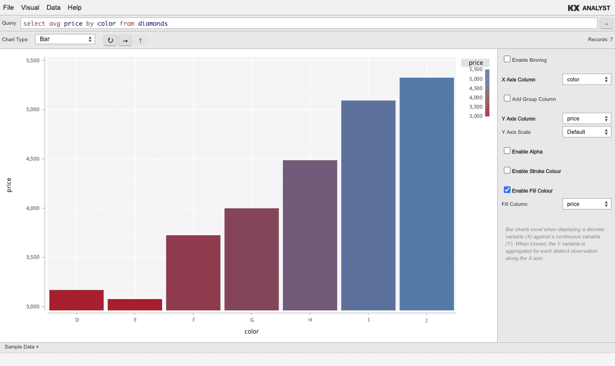
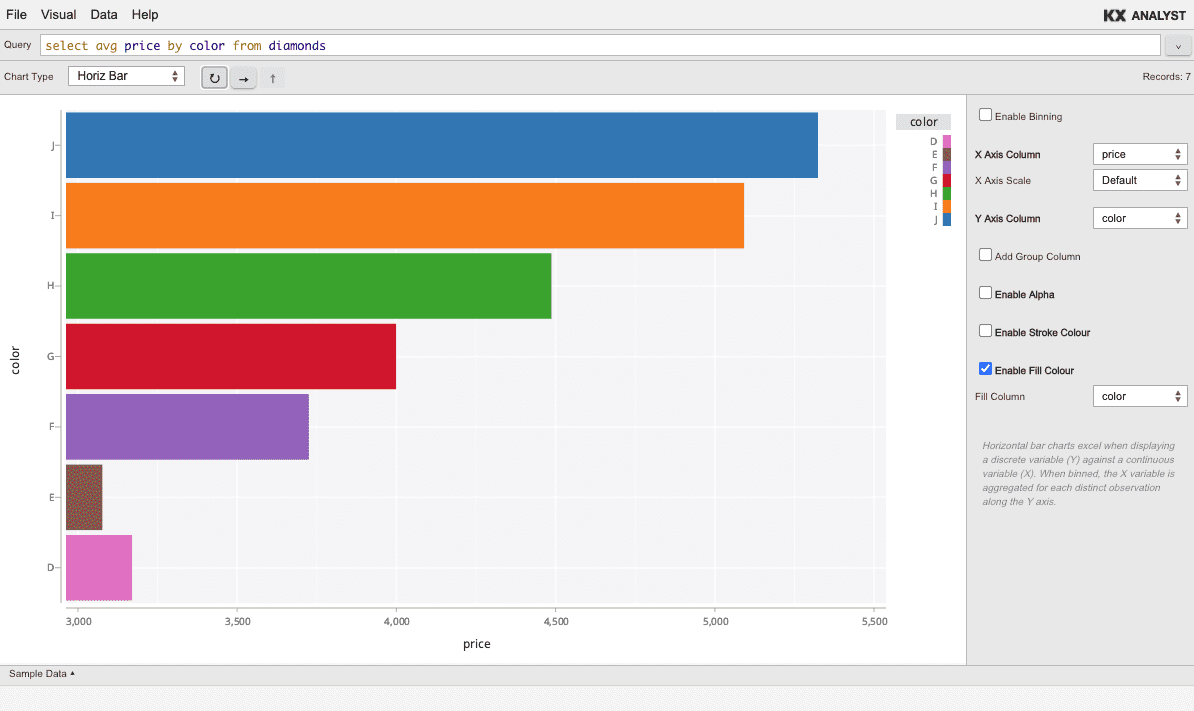
Some properties are common to all charts. In all of them, a blue or gray dropdown box represents the choice of a specific column of the data for mapping. A white dropdown box represents other options related to the mapping, but not concerning the column explicitly (aggregations, etc.).
Axes
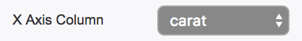
Axes appear in the sidebar as X Axis Column or Y Axis Column where available. They contain a single dropdown that specifies the column to use for the given axis.
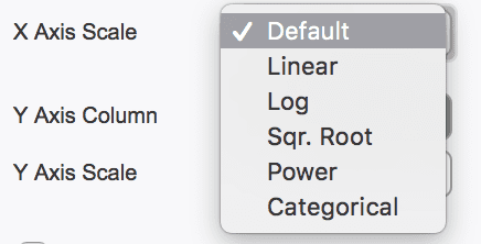
Scales
The axes can be customized in many of the plot types. A default scale
is used in most cases, which is either a linear scale for numeric
data, or a categorical scale for categorical data (symbols, strings,
etc).
When available, the property will appear in the sidebar as X Axis
Scale or Y Axis Scale, and will change the mapping of the column for
the given axis. For example, if a log-log scatter is desired, the X
Axis Scale and the Y Axis Scale would be changed to Log in the
corresponding dropdown menus.
Not all scale types work with all data. For example, applying a log scale to categorical data does not make sense, and will result in an error.
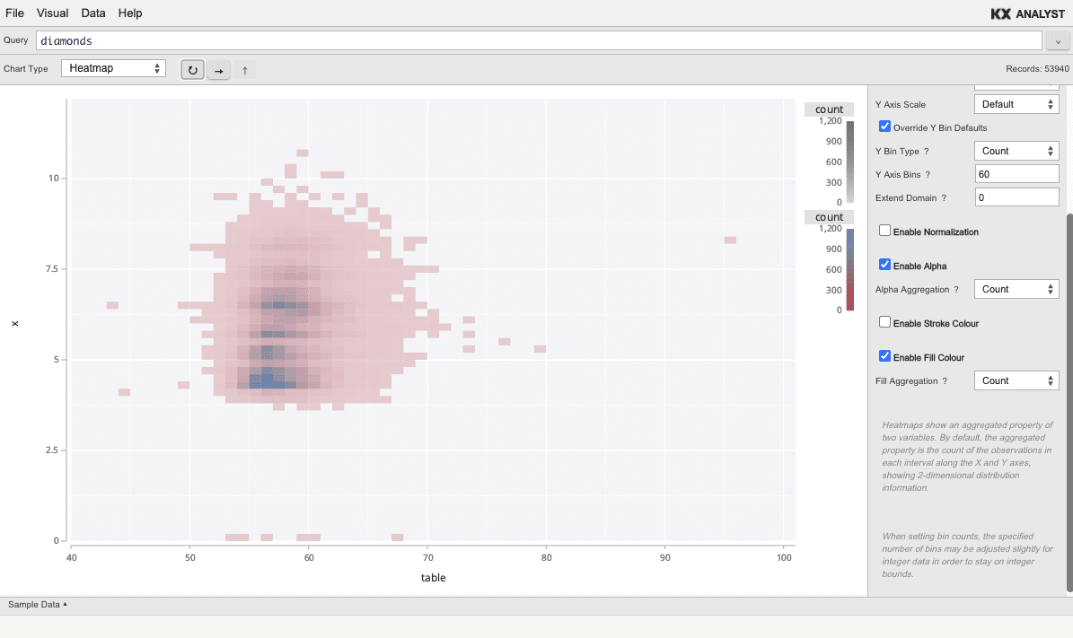
Binning
Many chart have the option of binning the data. When this option is available, there will be an Enable Binning checkbox in the Chart Properties. If this checkbox is checked (it is unchecked by default), the Chart Properties panel will update to display binning-specific properties (aggregations, etc.). When bins are available, by default, roughly 20 bins are used if the domain is numeric (fitting to the data if less than 20 integers), and the number of distinct items if the domain is categorical.
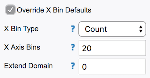
The default binning parameters can be overridden by checking the Override X Bin Defaults or Override Y Bin Defaults checkbox when available. Note this is not advised for categorical data since it is difficult to reason about which categories are in which bins. When checked, three new properties are exposed:
- Bin Type
-
either
Count(specify the number of bins) orWidth(specify the width of each bin) - Axis Bins
-
the value corresponding to the Bin Type (either the number of bins or the width of each bin)
- Extend Domain
-
a value to extend the top/right of the axis. By default no extension is carried out. This can be useful if wanting to specify the bin width, but the data maximum does not fall on an even number. For example, if the axis maximum is 50 and the minimum is 0, the extension could be set to 50 and a width of 5 specified to get 20 even bins from 0 to 100 of 5 units each.
Unbinned aesthetics
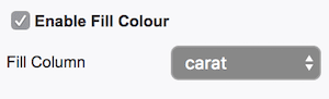
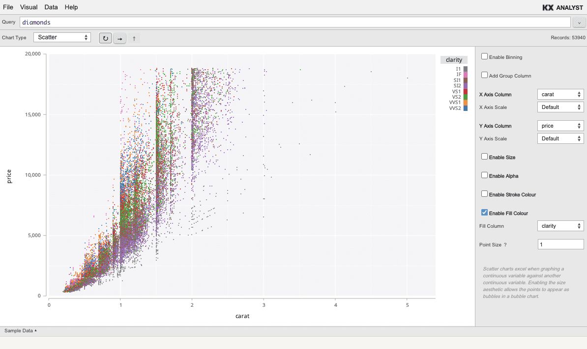
When binning is disabled (unchecked), aesthetics such as size, fill colour, stroke colour, and alpha (opacity) can be mapped to a variable in the query. Simply check the checkbox corresponding to the aesthetic desired, then select the column you would like to map to the aesthetic from the resulting dropdown.
For example, to assign the column sym to the fill colour in a scatter,
check the Enable Fill Colour checkbox, then select sym from the blue
dropdown that appears.
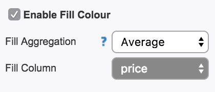
Binned aesthetics
Binned Aesthetics are similar to Unbinned Aesthetics, but require an accompanying aggregation. Since many records will be represented by a single visual mark, the records need to be aggregated to a single value to map to an aesthetic.
When Enable Binning is checked, the aggregation options will appear
for the aesthetic properties. By default, Count is used. Uniquely,
count does not require a column, since it simply gives the number
of records in the bin. All other aggregations require a column to
aggregate. The aggregations available are as follows:
- Count (does not require a column)
- Average
- Max
- Min
- Distinct (the number of distinct entries of the column within the bin)
- Std. Deviation
- Sum
- First
- Last
- Group Column (use this to map the aesthetic to the value of the current group of the layer if Add Group Column has been selected)
Histogram
The histogram bins a single column along the X axis, and (by default) depicts the count of each bin. The histogram is always binned.
Heatmap
Heatmap is a 2-dimensional binning. Two columns are specified and binned along the X and Y axes. The heatmap is always binned.
Scatter
Scatter is a 2-dimensional visualization. Two columns are specified to map to the X and Y axes. Scatter is not binned by default.
Bar
Bar charts display a single bar for each value along the X axis.
Horiz bar
Horizontal bar charts display a single bar for each value along the Y axis.
Line
Line charts depict a line from left to right between two variables.