Data analysis walkthrough
A simple workflow suitable for data analysis.
Pre-flight
Read the Getting Started section.
Log in to Analyst and create a workspace.
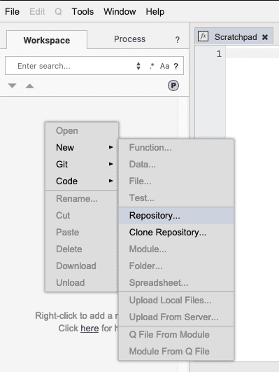
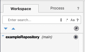
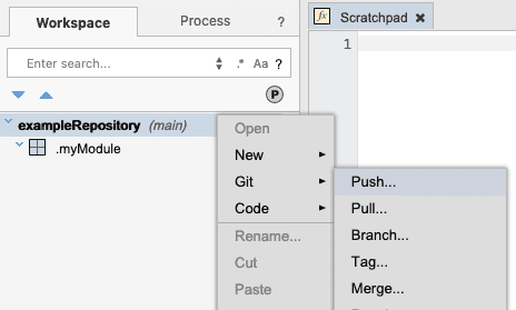
The first thing we need to do is create a repository. Repositories allow you to save versions of your work in a shared repository to share with other people and allow them to work on items in the repository as well. People who have access to the repository can push changes to it and pull changes from it. Right-click in the left tree pane of the window. A context menu will appear. Select New > Repository… from the context menu.
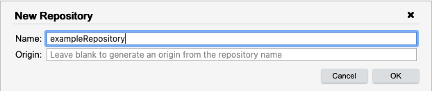
The New Repository dialog will appear. If this walkthrough is being done collaboratively, use a name that is unlikely to have been used before and is unique - for example: usernameDataWalkthrough, replacing username with your Analyst username. Going forward, the walkthrough will refer to the repository as exampleRepository.
The repository will now appear in the tree.
Create a module in the workspace
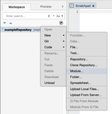
Now let’s create a module in the repository. Right-click on the repository and select New > Module… from the menu. Modules are packages of artifacts and may contain code functions, code scripts, transformations, visualizations, and more.
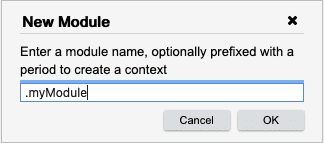
Type .myModule in the dialog box and press OK.
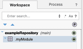
The module will appear in the search pane. The small green plus sign indicates that the module has been added to the workspace but not yet committed or pushed to the repository. All entities are managed by Analyst and saved into the Analyst repository.
Right-click on the repository and select Git > Push from the context menu.
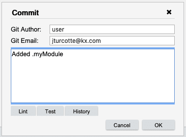
The Commit Message dialog will appear. This dialog allows you to enter a commit message, as well as set the Git author and Git email fields for this commit. Since you may be pushing changes to the repository on a regular basis, it makes sense to provide a meaningful commit message. Leaving the author and email fields blank, enter a commit message and click OK.
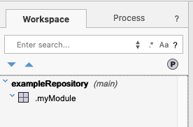
You will notice that the icon disappears from .myModule. This means that anyone else who has access to the repository is now able to pull the repository and get the new module.
Cloning a Git repository
Now let’s clone a different Git repository from an external source. Right click in the tree and select Git > Clone. This opens the Credentials Dialog, where you can specify your credentials and the origin of the Git repository to clone.
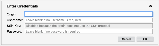
Enter the following information into the Credentials Dialog, and then click OK.
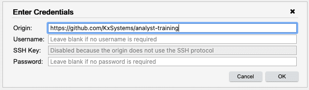
The Pull Repository dialog appears. It allows you to pull any branch of the repository. Click OK.
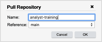
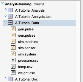
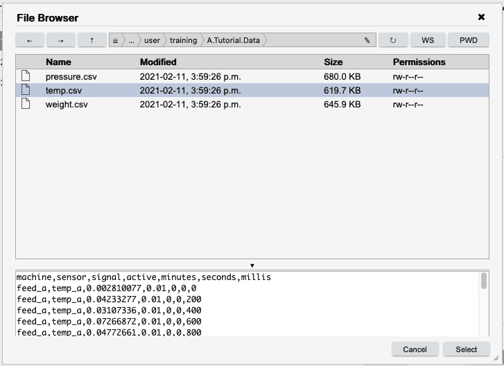
This has cloned the remote Analyst Training repository into our workspace. Open the A.Tutorial.Data module in the analyst-training repository. In the next few steps, we will load temp.csv into memory,
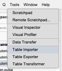
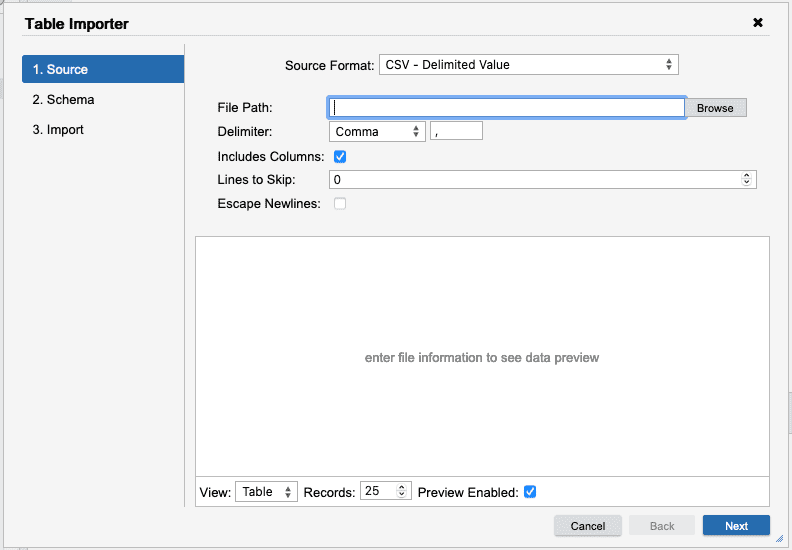
Import a dataset from CSV, JSON, ODBC or kdb+
Select Tools > Table Importer from the main menu.
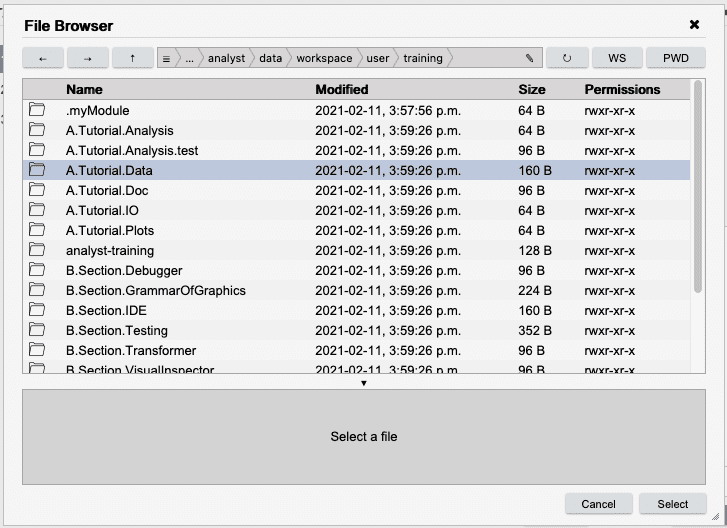
In the open Table Importer dialog, select CSV for Source Format, then click Browse.
Click the WS button. This ensures you are in your Workspace directory. Double-click the A.Tutorial.Data directory. This will move you to the A.Tutorial.Data directory.
Select temp.csv and press Select.
The dialog will disappear. The file name will appear in the input field and you will see a preview of the contents of the file in the previewer at the bottom of the Table Importer. Press Next to move to the Schema tab.
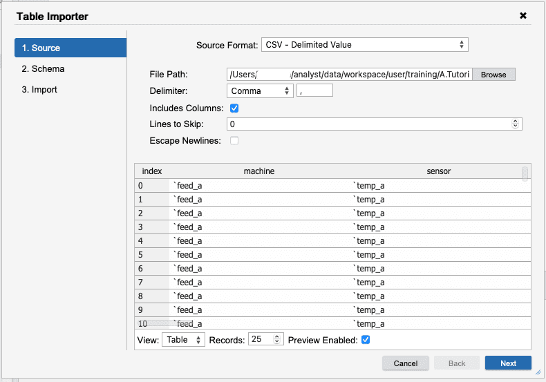
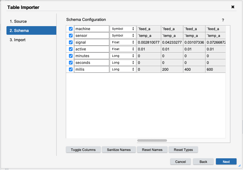
The Schema tab is where the column names and types
can be manipulated before importing. Here, we will want to change the types for
the machine and sensor columns to Symbol. The signal, and active
columns should be float. All of the remaining columns should be set to Long.
Pressing Next takes you to the Import tab where a final action can be selected.
We could directly import the table, but instead we want to fix messy columns first. To do
this, select Transform in the Import Type select. Finally, pressing Finish will
launch into the Table Transformer.
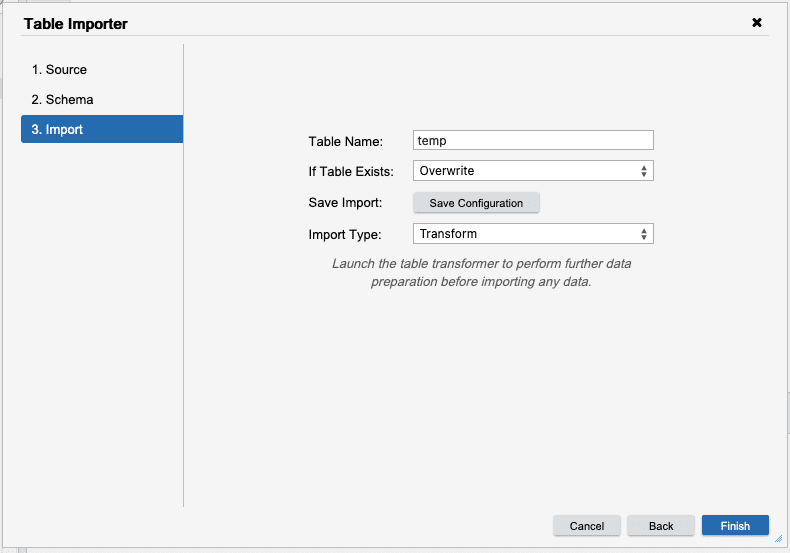
Table Transformer (KX Analyst only)
Note if not using KX Analyst, skip to the
Data Simulationsection to generate the sensors data.
Using the transformer, we can do more complex data transformations before importing the data. The transformer works on a sample of the data to build up a workflow of actions that will transform the data into a usable format. Once the transform has been built, it can be executed on the current data or saved into a compiled kdb+ function and parameterized.
![]()
For this transform we will add an Action node to the transform add a moving column.
![]()
First, right-click the node and select New > Action. Now right
click the signal column and select Add Column....
![]()
Add Column
------------------------------------------------
       New Column             Value
          ma               4 mavg signal
![]()
After pressing Ok the add column action will appear in the action list for the
given node. Finally, we can add an output node to the workflow to capture the data.
Right-click the action node and select New > Output. This will open the Table Exporter
to configure the output node. For now, we will import this data into our current process.
To do this, select the KDB format with the table type of Memory and press Finish
Table Exporter
-------------------------------------------------------------------------------
                     Select: KDB - kdb+ Database

    Table Format    : Memory
    Table Name      : signals
    If Table Exists : ☑ Overwrite  ☐ Append
![]()
The transformation can now be run using Transform > Run or alternatively it can be
saved and executed like a function.
ImportSensors
To save time, a more complete transformation has already been provided in
A.Tutorial.IO/ImportSensors. Before opening this transform, ensure that the
process is in the workspace directory.
![]()
This transform takes three types of sensor data from csv files, reads the contents, joins them together, summarizes and writes the data to tables in memory. The table below details the different nodes in this transformation.
| Node | Type | Description |
|---|---|---|
temp |
Source | Temperature sensor data in a CSV file |
pressure |
Source | Pressure sensor data in a CSV file |
weight |
Source | Weight sensor data in a CSV file |
cleanup-temp |
Action | Add some features to the temperature table |
cleanup-pressure |
Action | Add some features to the pressure table |
cleanup-weight |
Action | Add some features to the weight table |
pressure_temp |
Join | Performs an insert on the pressure and temperature tables |
signals |
Join | Performs an insert on the joined table using weight sensors |
aggregate-signals |
Action | Adds some extra aggregations across all sensors |
filter-signals |
Action | Filters out signals to a single machine sensor combination |
summarize |
Function | Performs a custom summary aggregation |
Graphic |
Graphic | Displays a filtered signal reading plot |
summary |
Output | An output table of the summarized signals |
signals |
Output | An output table of sensor signal data |
Select the Graphic node to display the graphs in the transformation.
![]()
Next select
Transform > Run to perform the importer. The transform will take ~30 seconds to ingest
the data on a reasonable laptop. The graphic that has been selected is showing a sensor signal plot of one sensor.
![]()
Alternatively, the transformation can be run as a function by invoking the transform.
// In a transformation, the first argument is for the inputs to the transform
// and the last argument is for the outputs. Providing null for both uses the defaults
// that were configured in the UI. A dictionary can be provided for each input or output
// that maps the name of the node in the UI to a new input or output configuration.
ImportSensors[::;::];

// Example with explicit input and output locations
ImportSensors[
    `temp`pressure!(`:A.Tutorial.Data/temp.csv; `:A.Tutorial.Data/Pressure.csv);

    // Output to a csv file called `signals.csv` - we need to change the output format
    // from a kdb+ table to a csv file by creating a new `.im.io` source descriptor
    enlist[`signals]!enlist .im.io.with.target[`:signals_out.csv] .im.io.create `csv
    ];

// Now there is a new file called signals_out.csv
contents: 10#read0 `:signals_out.csv;
Data simulation
Important
In the interest of time and space, the data that we have imported is very small so that it could easily be shared. For the remainder of the walkthrough, we will switch to using a simulated version of the data that is much larger than the data we have just imported.
// Running the simulation will take a bit of time but will produce far more data than
// what was imported. Once complete, there will be around ~10M simulated sensor readings
// in the new `sensors` table.
sensors: sim.system[];

// Check the count of the sensors table
count sensors
Visual Inspector
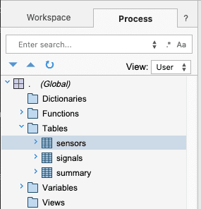
Now that the data has been generated, we can start exploring it. We can use the
Visual Inspector to visualize and tumble the data. Back on the main IDE page, we can use the Process View to see
which tables were imported. Select the Process tab in the search pane view to see
functions and data in our process. Under the global tables tab, we should find the tables
that were just imported.
└── . (Global)
    └── Tables
        ├── sensors
        ├── signals
        └── summary
Right-click on the sensors table and select Inspect. Alternatively, in a Scratchpad, type sensors and right-click
the line and choose Inspect or press CTRL+I (Windows) or ⌘I (macOS).
sensors
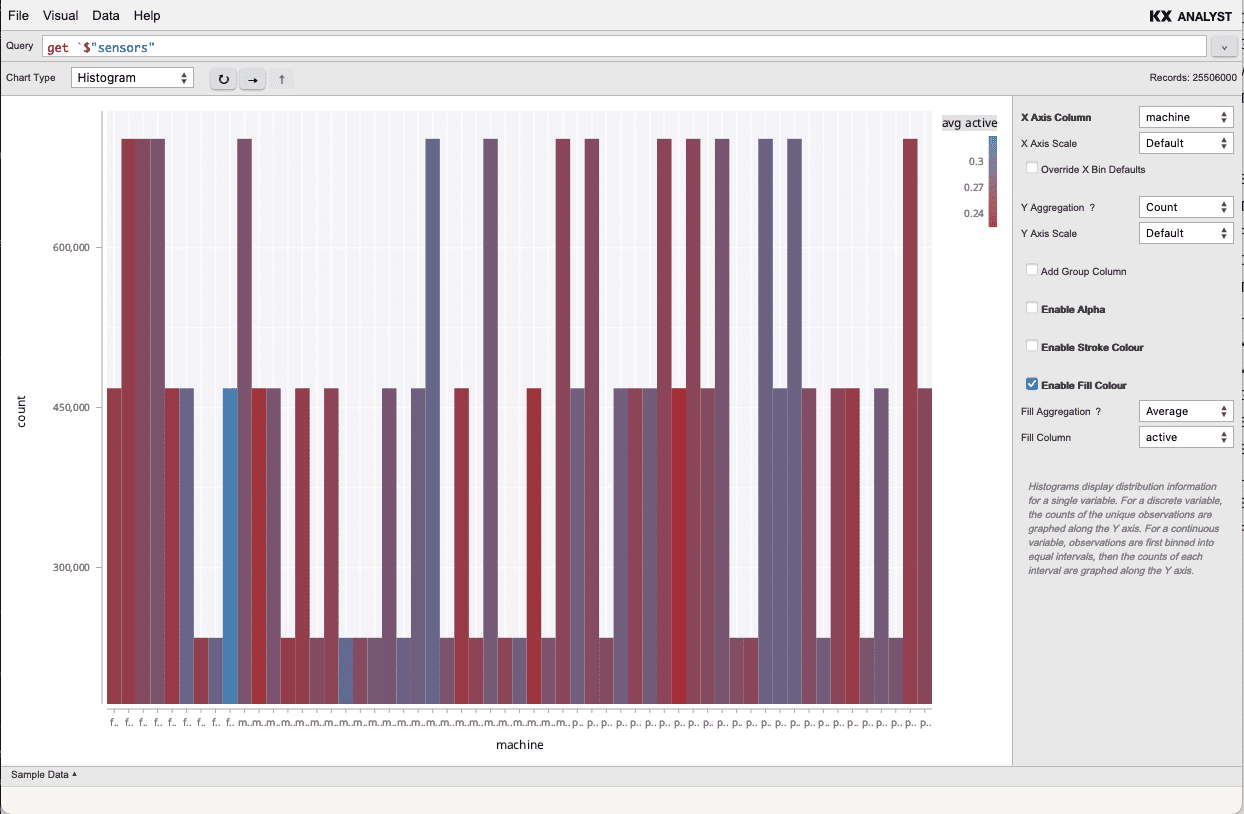
To get a sense of the distribution of the sensors across their machines, we can plot
a histogram of signal values. To add another dimension to the data, set the Fill Colour
to be the average active rate.
Visual Inspector
-------------------------------------------------------------------------------
 query: sensors
-------------------------------------------------------------------------------
 Chart Type: Histogram                     | X Axis Column    : machine
                                           | ...
                                           | ✓ Enable Fill Colour
                                           | Fill Aggregation : Average
                                           | Fill Column      : active
Now that we understand the distribution of the activity per sensor, we can look at the
average sensor readings over time. A visualization has been saved in
A.Tutorial.Plots/ReadingsOverTime. Double-click the plot to view the readings over time.
└── analyst-training
    └── A.Tutorial.Plots/Plots
        └── ReadingsOverTime
Let's turn our focus to the individual sensors readings. Let's look at all the distinct
sensor readings over time. Double-click the SignalBySensor plot in A.Tutorial.Plots to
view all of the discrete signals. This will be a messy plot but will allow us to visualize
the entire dataset.
└── analyst-training
    └── A.Tutorial.Plots
        └── SignalBySensor
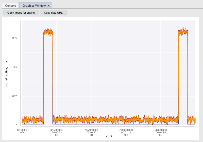
In the visual, one signal seems to go above the others. Click on it brings up a tooltip
that indicates the machine and signal as the id, that seem to be affected. Let's take
a closer look at this signal. We can use the quick plotting library that is included with
Grammar of Graphics to plot the signal for this sensor.
// Select only sensor that is failing. Replace the query keys with the ones from
// the tooltip in the visual inspector.
//
// Replace the `mach_g` value with the machine name and the `pressure_a` with the
// sensor name from the tooltip in the Visual Inspector
failing: select from sensors where machine=`mach_g, sensor=`pressure_a;
.qp.go[800; 500] plotSignal failing
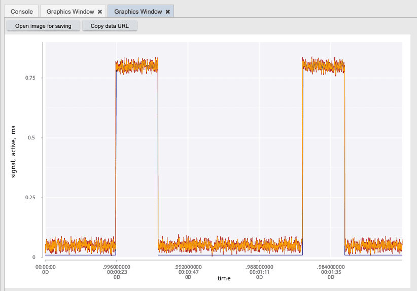
This likely indicates to us that we need to investigate this sensor further. There may be a faulty sensor or an actual issue with the machine itself. We would have expected to see a complete signal produced from this sensor. Ideally, something more like the following.
// Select the first machine, sensor combo
firstId: select from sensors where id = first id;

// Plot the signal
.qp.go[800;500] plotSignal firstId
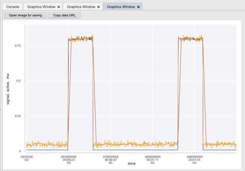
To clean this plot up and see more of the underlying patterns, we can use a simple smoothing
function to reduce the noise in the data. Here we can use the smoothReadings function to help
reduce the noise in the plot.
smooth: smoothReadings[10] firstId;
.qp.go[800;500] plotSignal smooth;
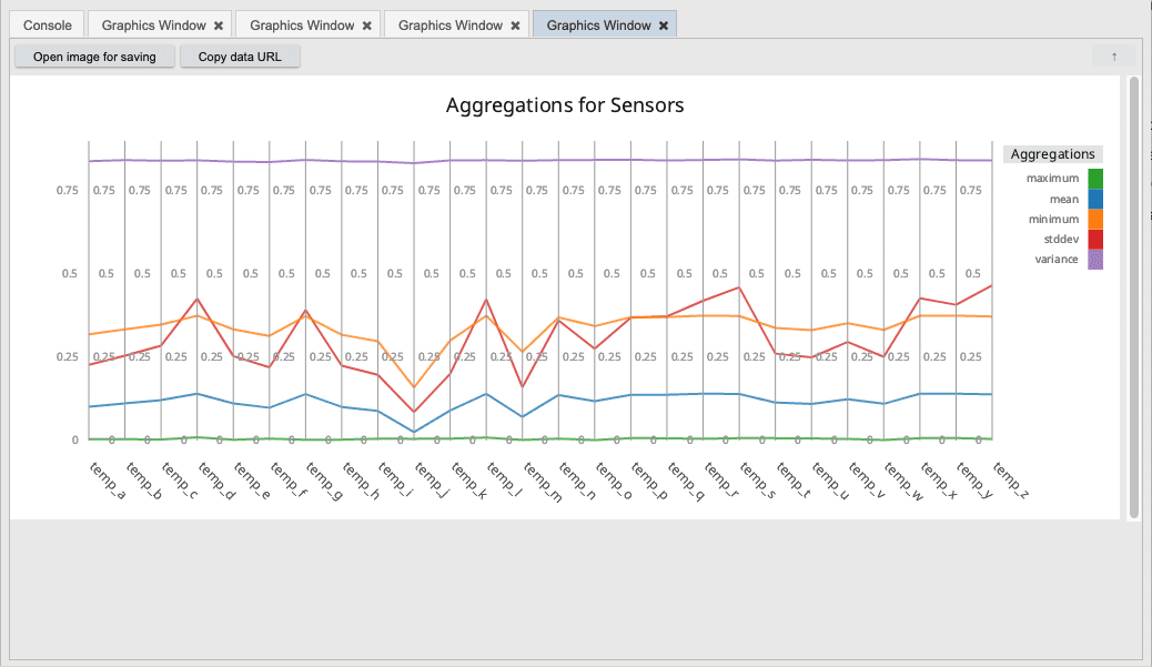
Let's take a look at one last facet of the data. We can use the Grammar of Graphics to express much more complex visualizations. For example, let's suppose we want to look at all of the temperature sensors for a given machine in our system. To get a high level comparison of all of these sensors, we can apply standard aggregations such as max, min, mean, etc. We can take all of these aggregations and plot them using a parallel line chart to represent each of the individual sensors. This gives us a high level comparison of the performance of these sensors and illustrates the complex visuals that can be generated from GG.
// Select all temperature sensors
allTemp: select from sensors where machine = first machine, sensor like "temp*";

// Plot all temperature sensor values as an aggregated rollup in parallel coordinates
.qp.go[1000;400] plotParallel allTemp
Summary
In this quick data analysis project, we took some simulated sensor data and imported it using using the Table Transformer. We then performed some ad-hoc visualizations using the Visual Inspector tool. We then built some custom visualizations using the Grammar of Graphics.
While performing our visualization on the sensors data, we identified a potential issue with one of the sensors in the system. We then created some custom visualization to investigate this further.
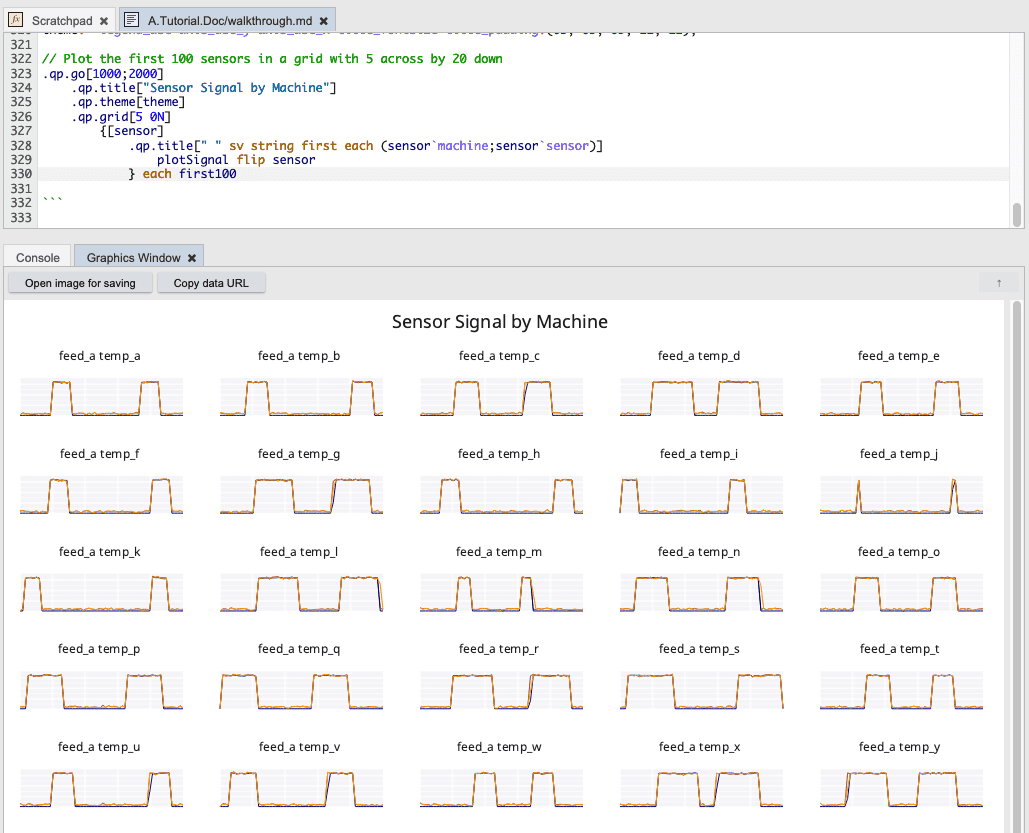
And finally, we will take the first 100 individual sensor signals by machine and plot them in a single visual summary.
// Select the first 100 sensors and filter the time dimension 1:100
first100: 100#value `id xgroup select from sensors where 0 = i mod 100;

// Theme for sensor grid
theme: `legend_use`axis_use_y`axis_use_x`title_fontsize`title_padding!(0b; 0b; 0b; 12; 12);

// Plot the first 100 sensors in a grid with 5 across by 20 down
.qp.go[1000;2000]
    .qp.title["Sensor Signal by Machine"]
    .qp.theme[theme]
    .qp.grid[5 0N]
        {[sensor]
            .qp.title[" " sv string first each (sensor`machine;sensor`sensor)]
                plotSignal flip sensor
            } each first100