Grammar of Graphics examples
These examples serve as a beyond-the-basics introduction to the Grammar of Graphics by example. The API used in these
examples are fully documented with many further examples in the API Reference within Analyst under
Help > Function Reference.
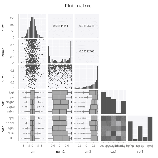
Plot matrix
The .qp.plot API takes a table and a number of column names to visualize. For any number of columns larger than 2,
a plot matrix will be presented showing pair-wise relationships between the columns.
// generate example data using a normal distribution
t: ([]
    num1:  .st.gen.normal 1000;
    num2:  {sin acos[-1] * x % max x} .st.gen.normal 1000;
    num3:  {cos acos[-1] * x % max x} .st.gen.normal 1000;
    cat1:  1000?5?`5;
    cat2:  1000?5?`5);

.qp.go[600;600] .qp.plot[t; (); ::]
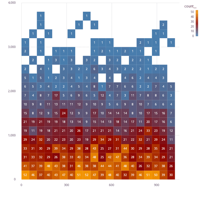
Annotated heatmap
The .qp.heatmap can be used to generate a binned heatmap, but in some cases it's useful to
have access to the binned data ahead of time. In this example, the binning is done ahead of time
with .st.bin2d, and used with a text geometry to annotate the bins with the count of the records
contained in each.
Generate data
n:10000;
y:1000*.st.gen.normal n;
x:n?1000;
t: select from ([]x;y) where y > 0;
Pre-bin and annotate
binned: .st.bin2d[`x`y; ::; ::; .st.a.count[]; ``center!(::;1b); t];
labels: .qp.s.labels `x`y!("";"");

.qp.go[700;700]
    .qp.theme[.gg.theme.clean]
    .qp.stack (
        .qp.rect[binned; `x_start__; `y_start__; `x_end__; `y_end__]
            .qp.s.aes[`fill; `count__] ,
            .qp.s.scale[`fill; .gg.scale.colour.gradient2[::;`steelblue;`darkred;`orange]] ,
            labels;
        .qp.text[binned; `x; `y; `count__]
            .qp.s.geom[``align`fill!(::;`middle;`white)] ,
            labels)
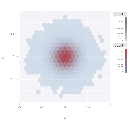
Hexbins
Hexbins are available as an option within the nD binning capabilities within .st.
Generate data
t: flip `x`y!1_2{.st.gen.normal 100000}\`
Visualize
Using .st.bin2d, the bins themselves can be modified to be hexagonal by specifying the optional
hex argument. If specified, the shape of the result is the coordinates for each hexagon container
along with any modifiers requested.
hexes: .st.bin2d[`x`y; ::; ::; .st.a.count[]; ``hex!(::;1b); t];

.qp.go[500;500]
    .qp.theme[``aspect_ratio!(::;`square)]
        .qp.polygon[hexes; `x; `y]
            .qp.s.aes[`fill`alpha; `count__`count__] ,
            .qp.s.scale[`fill; .gg.scale.colour.gradient . `steelblue`firebrick]
Polar charts
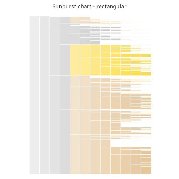
Sunburst chart
A sunburst chart is a custom visualization showing hierarchical weighted data. This plot, while not provided as a built-in chart, can be quite simply constructed from the components that are provided in the Grammar of Graphics.
Generate data
First, we need to generate some hierarchical weighted data.
// generate a binary tree of a given height
n  : sum "j"$xexp[2;]til height: 12;
ps : `,(,/)2#'(count[ls]-"j"$2 xexp height - 1)#ls: n?`8;
t  : ([]parent: ps; label: ls; amount: n?50);

// custom layout
arrange : {[fill; table; level; a; p; o]
    ra: select from table where parent = p;
    ra[`amount]: ra[`amount] % sum ra`amount;
    ra : `amount xdesc ra;
    if [0 = count ra; : ra];
    if [level = 4; fill: rand .gg.colour.brewer[`Set2;8]];
    if [(level > 4) and .1 > rand 1f; : ()];
    t: ([] parent: p;
           level : level;
           fill  : (count ra)#enlist fill;
           x1    : "f"$o+0,sums a*-1_ra`amount;
           w     : a*ra`amount;
           y1    : level;
           y2    : level + 1;
           label : ra`label);
    : t , raze .z.s[fill; table; level + 1]'[t`w; ra`label; t`x1] };

r: arrange[.gg.colour.DarkGray; t; 0f; 1; `; 0f];
r: update x1:"f"$x1, x2: x1 + w from r;
r: update tx: x1+w%2, ty: y1+0.5 from r;
Visualize
With the above data, the hierarchical weights can be depicted by using the rect
geom.
.qp.go[600;600]
    .qp.theme[.gg.theme.transparent]
    .qp.theme[`aspect_ratio`legend_use`axis_use_x`axis_use_y!(`square; 0b; 0b; 0b)]
    .qp.title["Sunburst chart - rectangular"]
    .qp.rect[r; `y1; `x1; `y2; `x2]
          .qp.s.geom  [enlist[`colour]!enlist .gg.colour.White]
        , .qp.s.scale [`y;     .gg.scale.extend[0b] .gg.scale.linear]
        , .qp.s.scale [`x;     .gg.scale.extension[0.3] .gg.scale.linear]
        , .qp.s.aes   [`fill;  `parent]
        , .qp.s.scale [`fill;  .gg.scale.colour.cat r[`parent]!r`fill]
        , .qp.s.aes   [`alpha; `level]
        , .qp.s.scale [`alpha; .gg.scale.alpha[50; 255]]
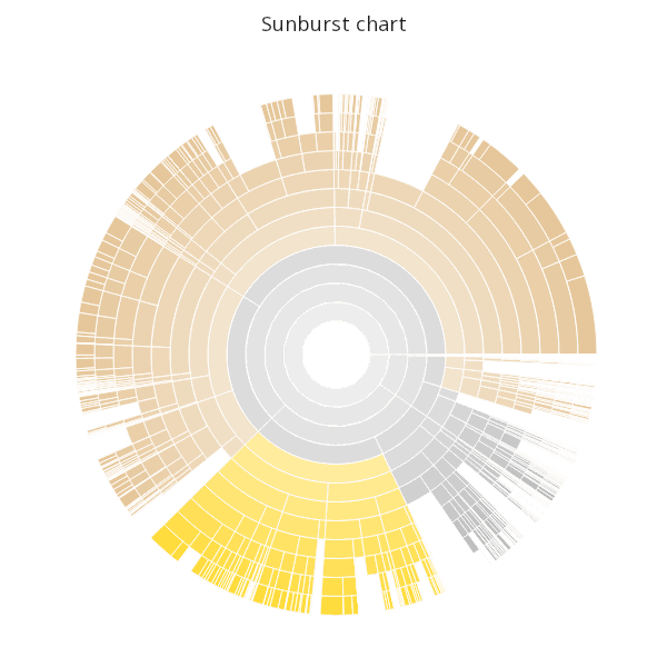
Plotting the exact plot above in polar coordinates gives the final sunburst chart.
.qp.go[600;600]
    .qp.theme[.gg.theme.transparent]
    .qp.theme[`aspect_ratio`legend_use`axis_use_x`axis_use_y!(`square; 0b; 0b; 0b)]
    .qp.title["Sunburst chart"]
    .qp.rect[r; `y1; `x1; `y2; `x2]
          .qp.s.geom  [enlist[`colour]!enlist .gg.colour.White]
        , .qp.s.scale [`y;     .gg.scale.extend[0b] .gg.scale.linear]
        , .qp.s.scale [`x;     .gg.scale.extension[0.3] .gg.scale.linear]
        , .qp.s.aes   [`fill;  `parent]
        , .qp.s.scale [`fill;  .gg.scale.colour.cat r[`parent]!r`fill]
        , .qp.s.aes   [`alpha; `level]
        , .qp.s.scale [`alpha; .gg.scale.alpha[50; 255]]
        // adding this line changes the chart coordinate system
        , .qp.s.coord [.gg.coords.polarn 20]
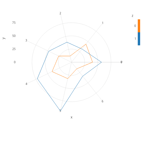
Radar
Radar charts can be drawn in several ways. Like sunburst charts, radar charts are created by drawing various geometries in polar coordinates.
Option 1: Use a path to connect lines
t:raze{t:([]x:til 7;y:10+7?100;z:x); t,first[t],(1#`x)!1#7}each til 2;

.qp.go[500;500]

    .qp.theme[.gg.theme.clean]
    .qp.theme[``aspect_ratio!(::;`square)]
    .qp.path[t;`y;`x] (::)
          .qp.s.scale[`y; .gg.scale.categorical[]]
        , .qp.s.scale[`x; .gg.scale.limits[0 0N] .gg.scale.linear]
        , .qp.s.aes[`group; `z]
        , .qp.s.aes[`fill; `z]
        , .qp.s.scale[`fill; .gg.scale.colour.cat10]
        , .qp.s.coord[.gg.coords.polarn 2];
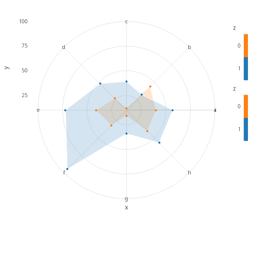
Option 2: Use a polygon for fill and add points
t2: select x, y by z from t;

.qp.go[500;500]
    .qp.theme[.gg.theme.clean]
    .qp.theme[``aspect_ratio!(::;`square)]
        .qp.stack (
            .qp.polygon[t2;`y;`x]
                  .qp.s.geom[``alpha`colour!(::;0x30;.gg.colour.White)]
                , .qp.s.scale[`y; .gg.scale.format[{.Q.a x}] .gg.scale.breaks[til 9] .gg.scale.linear]
                , .qp.s.aes[`fill; `z]
                , .qp.s.scale[`fill; .gg.scale.colour.cat10]
                , .qp.s.coord[.gg.coords.polarn 2];
            .qp.point[t; `y; `x]
                  .qp.s.aes[`fill; `z]
                , .qp.s.scale[`fill; .gg.scale.colour.cat10])
The Radar Chart and Sunburst Chart examples both make use of polar coordinates. Many common charts can also be constructed using geometries in polar coordinates, demonstrated below.
Generate data
// set base table
t:([] c:0; v:40 20 15 15 10; label: `label1`label2`label3`label4`label5);
// set low and high marks for interval geometry
t2: update l:(0,-1_sums v), h:sums v from t;
// set text y position to be halfway between the low and high
t2: update lx: 1, ly: l + v%2 from t2;
// Additional categories
t3:([] v:      24?45;
       label1: raze 3#enlist"label",/:8#.Q.a;
       label2: raze (8#enlist@) each "label",/:3#.Q.a);
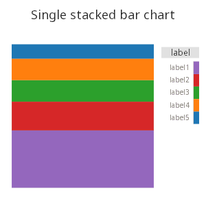
Stacked bar chart
The start with, below is a single stacked bar.
.qp.go[300;300]
    .qp.title["Pie chart"]
    .qp.theme[.gg.theme.blank , ``aspect_ratio!(::;`square)]
    .qp.bar[t;`c;`v]
          .qp.s.aes[`group;`label]
        , .qp.s.aes[`fill;`label]
        , .qp.s.scale[`fill; .gg.scale.colour.cat10]
        , .qp.s.scale[`y; .gg.scale.limits[0 0N] .gg.scale.linear]
        , .qp.s.scale[`x; .gg.scale.limits[-0.0001 0.0001] .gg.scale.linear]
        , .qp.s.geom[``position!(::;`stack)]
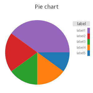
Pie chart
A pie chart in the Grammar of Graphics is just a stacked bar chart in polar coordinates. Taking the above chart and changing only the coordinate system gives a basic pie chart.
.qp.go[300;300]
    .qp.title["Pie chart"]
    .qp.theme[.gg.theme.blank , ``aspect_ratio!(::;`square)]
    .qp.bar[t;`c;`v]
          .qp.s.aes[`group;`label]
        , .qp.s.aes[`fill;`label]
        , .qp.s.scale[`fill; .gg.scale.colour.cat10]
        , .qp.s.scale[`y; .gg.scale.limits[0 0N] .gg.scale.linear]
        , .qp.s.scale[`x; .gg.scale.limits[-0.0001 0.0001] .gg.scale.linear]
        , .qp.s.geom[``position!(::;`stack)]
        , .qp.s.coord[.gg.coords.polar]
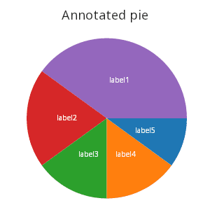
Annotated pie chart
Instead of using legends, the pie chart could be composed with a text geometry to annotate the wedges of the pie.
.qp.go[300;300]
    .qp.title["Annotated pie"]
    .qp.theme[.gg.theme.blank , ``aspect_ratio`legend_use!(::;`square;0b)]
    .qp.stack (
        // pie is a stacked bar in polar coordinates
        .qp.interval[t2; `c; `l; `h]
            .qp.s.scale[`x; .gg.scale.limits[0 0] .gg.scale.linear] ,
            .qp.s.aes[`fill; `label] ,
            .qp.s.coord[.gg.coords.polar];
        // add the wedge annotations
        .qp.text[t2; `c; `ly; `label]
            .qp.s.textalign[`middle] ,
            .qp.s.geom[``fill!(::;0xffffff)]);
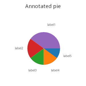
Perhaps the wedges would look better outside of the pie itself. The text annotations can be offset, drawn strictly to the right in rectangular coordinates to surround the pie chart.
.qp.go[300;300]
    .qp.title["Annotated pie"]
    .qp.theme[.gg.theme.blank , ``aspect_ratio`legend_use!(::;`square;0b)]
    .qp.stack (
        // pie is a stacked bar in polar coordinates
        .qp.interval[t2; `c; `l; `h]
            .qp.s.scale[`x; .gg.scale.limits[0 1] .gg.scale.linear] ,
            .qp.s.aes[`fill; `label] ,
            .qp.s.coord[.gg.coords.polar];
        // add the wedge annotations
        .qp.text[t2; `lx; `ly; `label]
            .qp.s.textalign[`middle]);
Within the Grammar of Graphics, the basic pie chart is not the only radial chart available. Any geometry or stack can be drawn in polar coordinates, resulting in many new chart types.
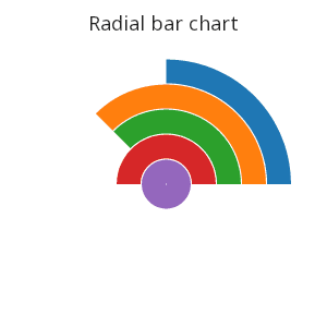
Radial bar chart
.qp.go[300;300]
    .qp.theme[.gg.theme.blank , ``aspect_ratio`legend_use!(::;`square;0b)]
    .qp.title["Radial Bar Chart"]
    .qp.bar[t; `label; `v]
        .qp.s.scale[`y; .gg.scale.limits[0 0N] .gg.scale.linear] ,
        .qp.s.aes[`fill; `label] ,
        .qp.s.coord[.gg.coords.polar]
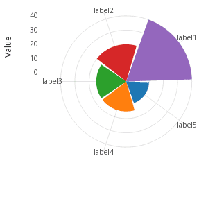
Nightingale Rose chart
The Nightingale Rose chart is a stacked horizontal bar chart in polar coordinates.
.qp.go[300;300]
    .qp.theme[.gg.theme.clean , ``aspect_ratio`legend_use!(::;`square;0b)]
    .qp.hbar[t; `v; `label]
        .qp.s.scale[`x;.gg.scale.extension[0.3] .gg.scale.limits[0 0N] .gg.scale.linear] ,
        .qp.s.aes[`fill; `label] ,
        .qp.s.labels[`x`y!("Value";"")] ,
        .qp.s.coord[.gg.coords.polar];
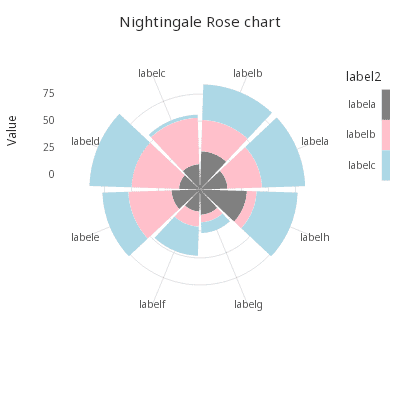
Alternate Nightingale Rose chart
Using the horizontal bar chart properties, a Nightingale Rose chart can be stacked or dodged as well.
Stacked bars
.qp.go[400;400]
    .qp.theme[.gg.theme.clean , ``aspect_ratio`legend_use!(::;`square;1b)]
    .qp.title["Nightingale Rose Chart"]
    .qp.hbar[t3; `v; `label1]
        .qp.s.aes[`fill`group; `label2`label2] ,
        .qp.s.geom[``position!(::;`stack)] ,
        .qp.s.scale[`fill; .gg.scale.colour.cat distinct[t3`label2]!`grey`pink`lightblue] ,
        .qp.s.scale[`x; .gg.scale.extension[0.3] .gg.scale.limits[0 0N] .gg.scale.linear] ,
        .qp.s.labels[`x`y!("Value";"")] ,
        .qp.s.coord[.gg.coords.polar];
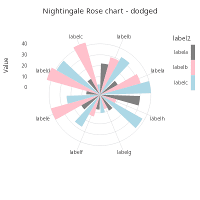
Dodged bars
.qp.go[400;400]
    .qp.theme[.gg.theme.clean , ``aspect_ratio`legend_use!(::;`square;1b)]
    .qp.title["Nightingale Rose Chart - Dodged"]
    .qp.hbar[t3; `v; `label1]
        .qp.s.aes[`fill`group; `label2`label2] ,
        .qp.s.geom[``position!(::;`dodge)] ,
        .qp.s.scale[`fill; .gg.scale.colour.cat distinct[t3`label2]!`grey`pink`lightblue] ,
        .qp.s.scale[`x; .gg.scale.extension[0.3] .gg.scale.limits[0 0N] .gg.scale.linear] ,
        .qp.s.labels[`x`y!("Value";"")] ,
        .qp.s.coord[.gg.coords.polar];
Custom analytics and multiple layers
Since multiple independent tables can be added to a single chart as separate stacked geometries using
.qp.stack, charts can be assembled from many individual layers and datasets.
Additionally, since the library is built from code, custom charts or chart segments can be abstracted into named functions. Thus, a collection of ready-to-go domain-specific charts could be built up.
Generate data
n:20000;
t:([]date:raze 200#'2015.01.01+til 100; price:sums?[n?1.<0.5;-1;1]);
ohlc : 0!select open:first price, close:last price, high:max price, low:min price by date from t;
update gain: close > open from `ohlc;
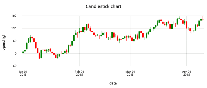
Candlesticks
Visualize
candlestick : {
    fillscale : .gg.scale.colour.cat 01b!(.gg.colour.Red; .gg.colour.Green);

    .qp.theme[enlist[`legend_use]!enlist 0b]
    .qp.stack (
        // open/close
       .qp.interval[x; `date; `open; `close]
            .qp.s.aes[`fill; `gain]
            , .qp.s.scale[`fill; fillscale]
            , .qp.s.geom[`gap`colour!(0; .gg.colour.White)];
        // low/high
        .qp.segment[x; `date; `high; `date; `low]
            .qp.s.aes[`fill; `gain]
            , .qp.s.scale[`fill; fillscale]
            , .qp.s.geom[enlist [`size]!enlist 1])
    };

.qp.go[700;300]
    .qp.theme[.gg.theme.clean]
    .qp.title["Candlestick chart"]
    candlestick ohlc
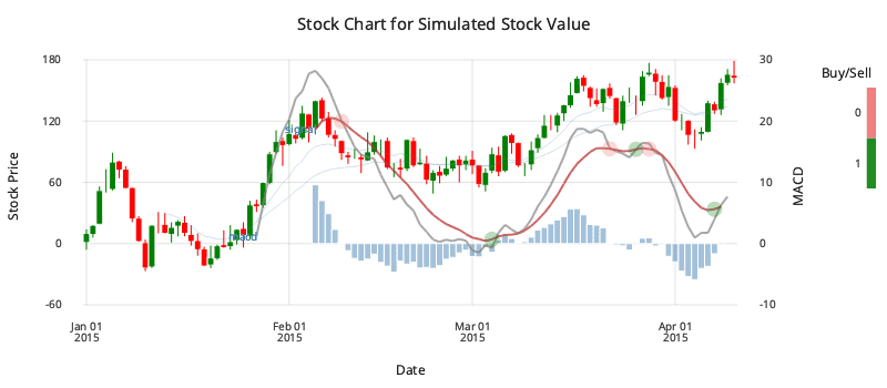
Left and right axes
Named custom charts can themselves be used as first-class layers in the Grammar of Graphics, meaning they can be stacked with more layers to build up complex charts, or split between a left and right y axis.
This uses the candlestick wrapper created above.
signal: select date, ma12, buy:macd < 9 mavg macd from ohlc where not =':[signum ma12 - ma26];

.qp.go[800;300]
    .qp.theme[.gg.theme.clean]
    .qp.theme[``grid_style_x`labels!(::;`none;`x`y!("";""))]
    .qp.title["Stock chart of simulated values"]
    // split the two charts on left (first) and right (second) y axes
    .qp.split (
        // macd interval on left axis
        .qp.interval[ohlc; `date; `zero; `histo; .qp.s.geom[``size`alpha!(::;2;0x2f)]];

        // a candlestick and two moving averages on right y axis
        .qp.stack (
            candlestick ohlc;
            .qp.line[ohlc; `date; `ma12; .qp.s.geom[``fill`size!(::;`red;1.5)]];
            .qp.line[ohlc; `date; `ma26; .qp.s.geom[``fill`size!(::;`steelblue;1.5)]];

            // indicators
            .qp.point[signal;`date; `ma12]
                .qp.s.aes   [`fill; `buy] ,
                .qp.s.scale [`fill; .gg.scale.colour.cat 01b!`red`green] ,
                .qp.s.geom  [``size`colour`alpha!(::;10;`white;0x4f)]))
These named custom charts can themselves be used as first-class layers in the Grammar of Graphics, meaning they can be stacked with more layers to build up complex charts.
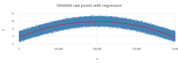
Linear regression
A built-in smoother using an n-degree linear regression is provided as .qp.smooth. Other custom
analytics can be used by calculating the fit ahead of time and mapping the result to a layer.
n:1000000
t: ([]x:til n; y:(10*sin acos[-1]*til[n]%n)+.st.gen.normal n)
Smoothers are often useful when stacked with the underlying data. For example, below the fit is stacked with the underlying data drawn as raw points.
.qp.go[700;250]
    .qp.theme[.gg.theme.clean]
    .qp.title[string[n] , " raw points with regression"]
    .qp.stack (
        .qp.point  [t; `x;`y; .qp.s.geom[``size!(::;1)]];
        .qp.smooth [t; `x;`y;`stat`degree!(`lsq;2); .qp.s.geom[``size`fill!(::;2;`red)]])
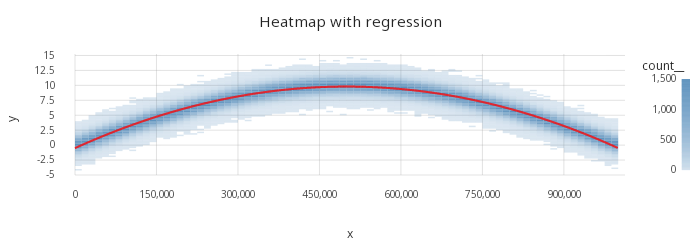
A heatmap could be used to summarize the underlying data distribution as well.
.qp.go[700;250]
    .qp.theme[.gg.theme.clean]
    .qp.title["Heatmap with regression"]
    .qp.stack (
        .qp.heatmap[t;`x;`y]
            .qp.s.biny[`c;80;0] ,
            .qp.s.binx[`c;80;0];
        .qp.smooth[t; `x;`y;`stat`degree!(`lsq;2); .qp.s.geom[``size`fill!(::;2;`red)]])
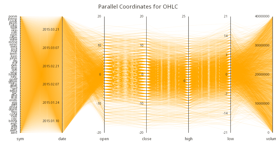
Parallel coordinates
The are several ways to achieve a parallel coordinates plot using the Grammar of Graphics.
First, mock some data.
// Load the data
data: raze {
    open:"f"$sums 90?-1 0 1;
    ([]sym:x;date:2015.01.01+til 90;open:open;close:-2.5+open+90?5;high:-2.5+open+90?8;low:-2.5+open+90?8;volume:90?40000000)
    } each `AAPL,50?`4;
Then, using the lower-level scale API, the parallel coordinates can be built up. This also demonstrates how visuals can themselves be programmed rather than fully specified ahead of time.
cs:    cols data;
n:     count cs;

// Initialize a scale for each column and store the breaks and limits
scales: .gg.scale.initBreaks each .gg.scale.init[.gg.scale.default] each data cs;
// Breaks are the ticks of a scale, and limits are the max and min (cleaned)
breaks: scales@\:`breaks;
limits: scales@\:`limits;

// A helper to turn a column name into a pixel coordinate name
pcol:   `$"p",string@;

// Strategy is to extend the table to display with columns for 0-1 normalized space
xpos:   (pcol each til n)!til n;
points: data ,' flip xpos , (pcol each cs)!{[s;l;x] (.gg.scale.apply[s;x] - l 0) % l[1] - l 0 }'[scales; limits; data cs];

// Pairs of column names for segment geometry (line from p1 to p2)
pairs: cs -1_til[n] ,' next til n;

// A table of text for the axes
text:  {[i;s;b;l] flip `v`x`y!(.gg.scale.inverse[s;b]; i;) (b - l 0) % l[1] - l 0 }'[til count scales; scales; breaks; limits];

// The text geometries for the axes
labels: {
    .qp.text[x; `x; `y; `v]
          .qp.s.textalign[`right]
        , .qp.s.geom[``offsetx!(::; -10)]
    } each text;

// The vertical lines for the axes
grids: .qp.vline[; ::] each til n;

// Titles for each axes
titles: .qp.text[flip `v`x`y!(cs; til count cs ;0); `x; `y; `v]
      .qp.s.textalign[`middle]
    , .qp.s.geom[``size`offsety!(::; 12; 20)];

// The *grid* is just the labels and the axes
coordinates: .qp.stack labels , grids , enlist titles;

// A collection of segments for each pair of columns
segments: .qp.stack {[d;i;p]
    .qp.segment[d; pcol i; pcol p 0; pcol i + 1; pcol p 1]
        .qp.s.geom[`fill`alpha!(`orange; 20)]
    }[points]'[til count pairs; pairs];

// Parallel coordinates is just the set of axes and the set of segments
.qp.go[900;500]
    .qp.theme[.gg.theme.transparent]
    .qp.theme[`canvas_fill`axis_use_x`axis_use_y`padding_left`padding_bottom!(0xffffffff; 0b;0b;60;60)]
    .qp.title["Parallel Coordinates for OHLC"]
    .qp.stack (segments; coordinates)