Visual Inspector - additional charts
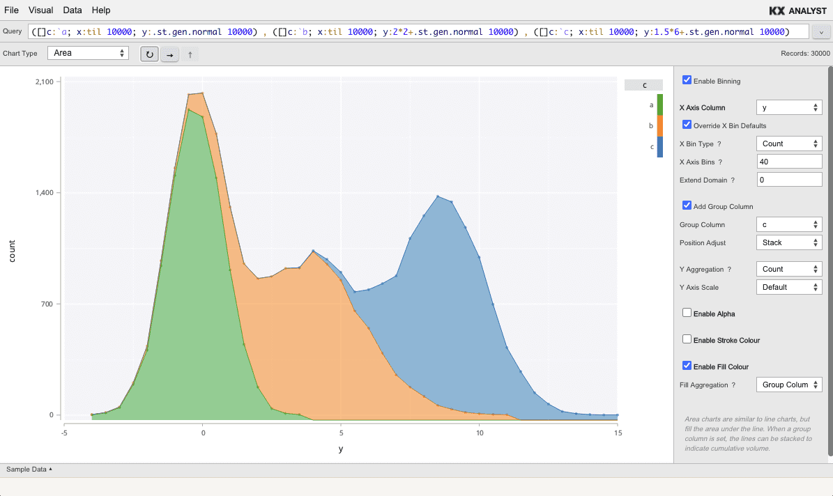
Area
Area charts are similar to line charts, but fill the area under the line. When a group column is set, the lines can be stacked to indicate cumulative volume.
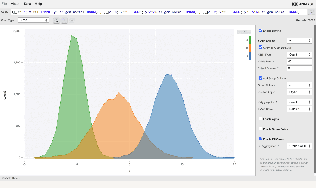
Area charts with group columns can either be layered, as shown above, or stacked, as shown below.
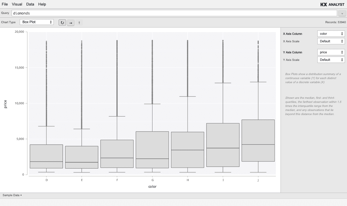
Box plot
The box plot depicts (typically) a category along the X axis and a numeric column along the Y axis. For each category, the average, quartiles, and outliers are depicted.
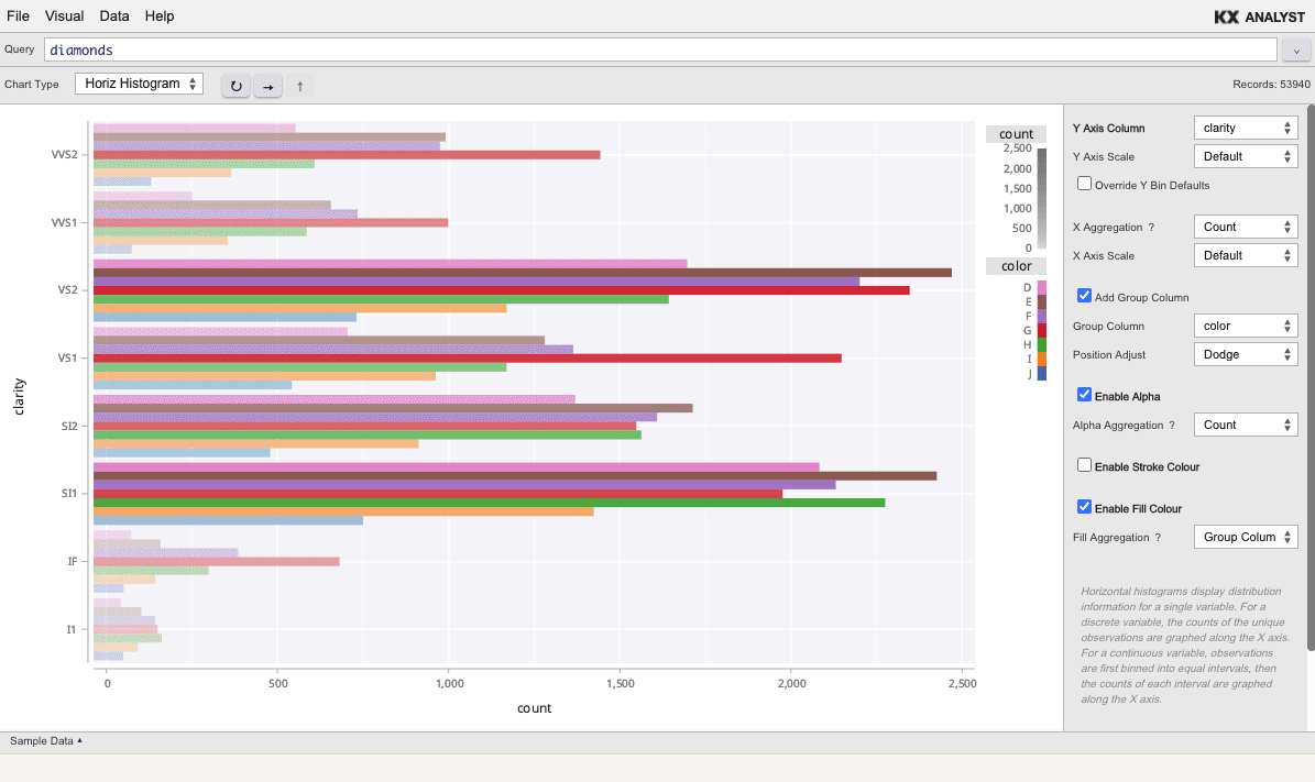
Horiz histogram
The horizontal histogram is the same as the Histogram, but bins along the Y axis, depicting the aggregation along the X axis. The Horiz Histogram is always binned.
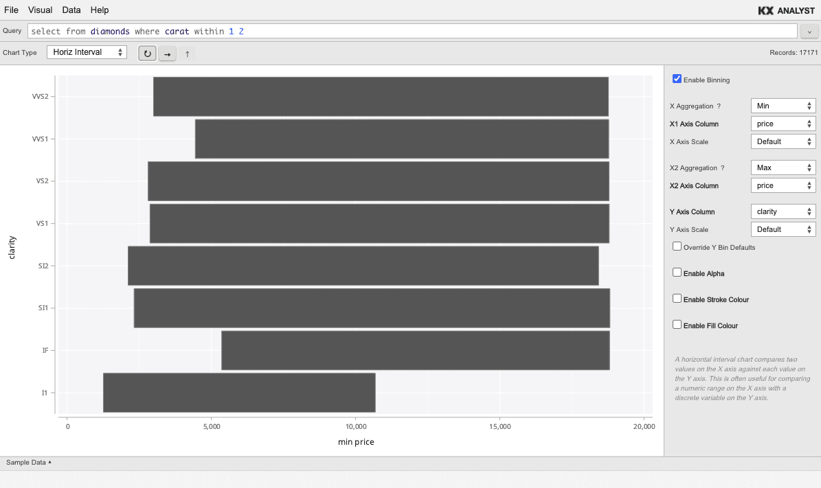
Horiz interval
A horizontal interval chart compares two values on the X axis against each value on the Y axis. This is often useful for comparing a numeric range on the X axis with a discrete variable on the Y axis.
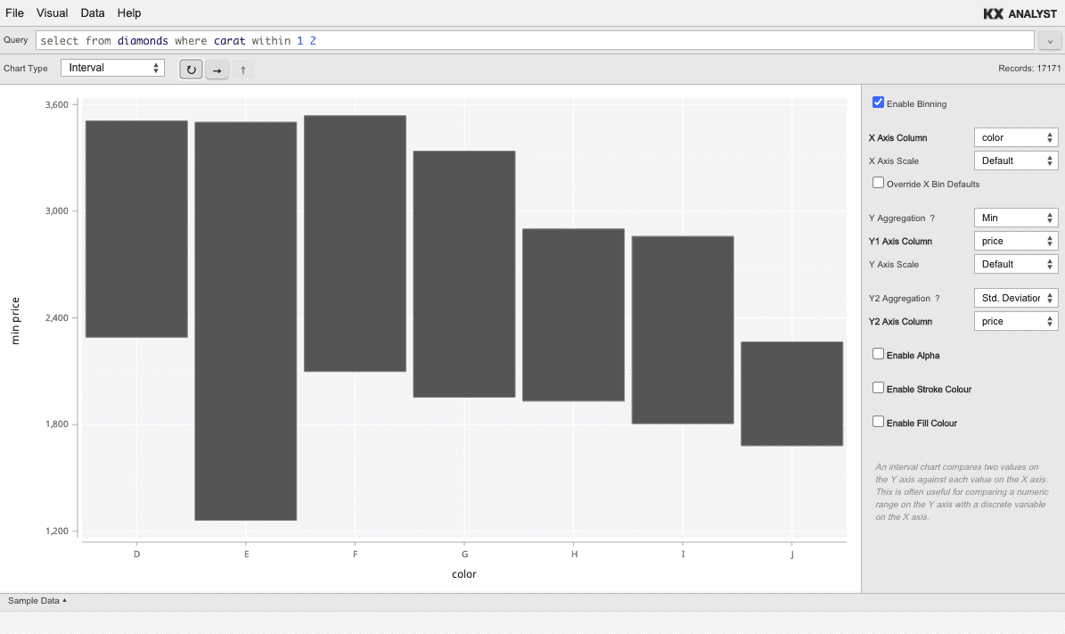
Interval
An interval chart compares two values on the Y axis against each value on the X axis. This is often useful for comparing a numeric range on the Y axis with a discrete variable on the X axis.
Map
A map plot is a Scatter over an underlying geographic map. The X and Y axes should be longitude
(values from -180 to 180) and latitude (values from -90 to 90) respectively.
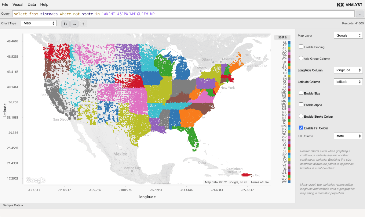
To use the map plot type, a Google Maps key must be provided. Once an API key is obtained, it can be used by setting an environment variable. Refreshing the Inspector once this has been done will enable the Map chart.
Google Maps
`AX_GOOGLE_MAPS_KEY setenv "mykey"
MapBox
Both of the following environment variables must be set to use the MapBox layer.
`AX_MAPBOX_KEY setenv "mykey"
`AX_MAPBOX_STYLE setenv "user/styleid"
The MapBox style ID is found as part of the URL for any MapBox style in studio.mapbox.com. Given a style
url of //styles/user/id, the user/id segment is used in the environment variable above.
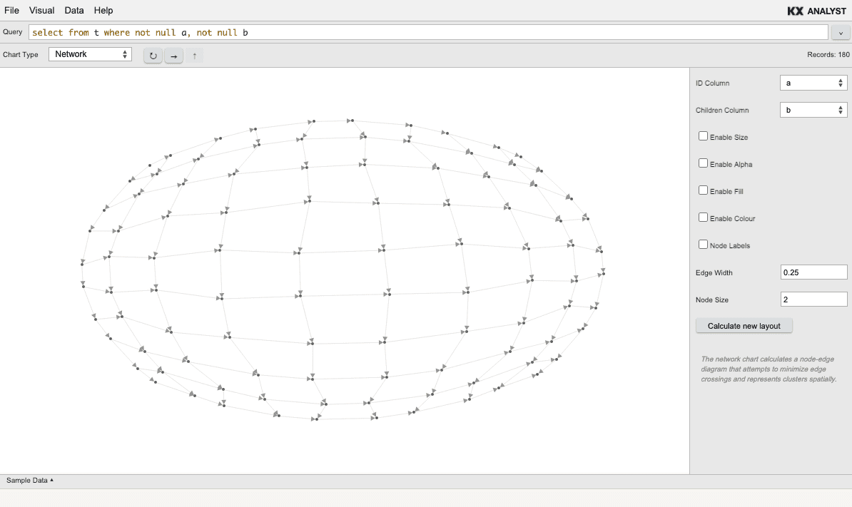
Network
The Visual Inspector supports the visualization of networks (directed graphs) through a force-directed layout.
There are two ways for data to be formatted so that the Directed Graph visualization can determine the parent-child relationships. First, a parent and child column can simply be supplied. This would look like:
Parent | Child
-------|-------
A      | B
A      | C
C      | B
Alternatively, each entry in the child column could be a list of all children for the given parent. This allows for more compact tables. For example:
Parent | Child
-------|-------
 A     | B C
 C     | B
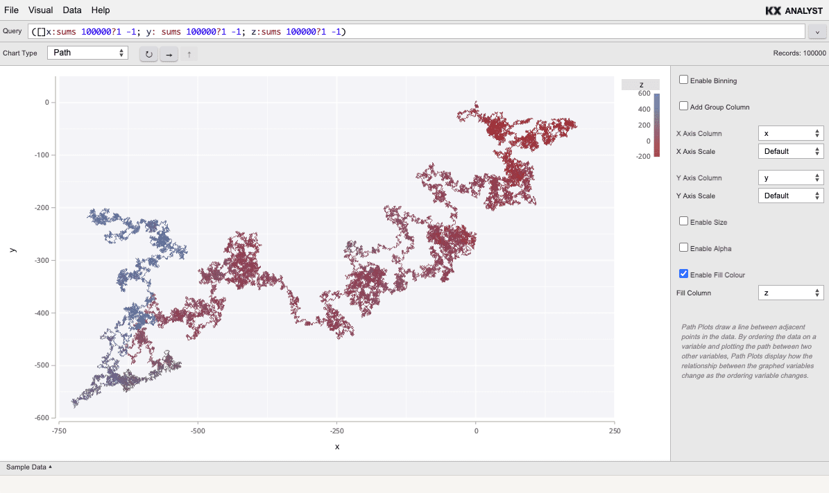
Path
A path plot is similar to a line plot, but the line is not drawn left to right. Instead, the line is drawn in the order of the data. The two columns specify the points of the line, and the points are simply traced with a line.
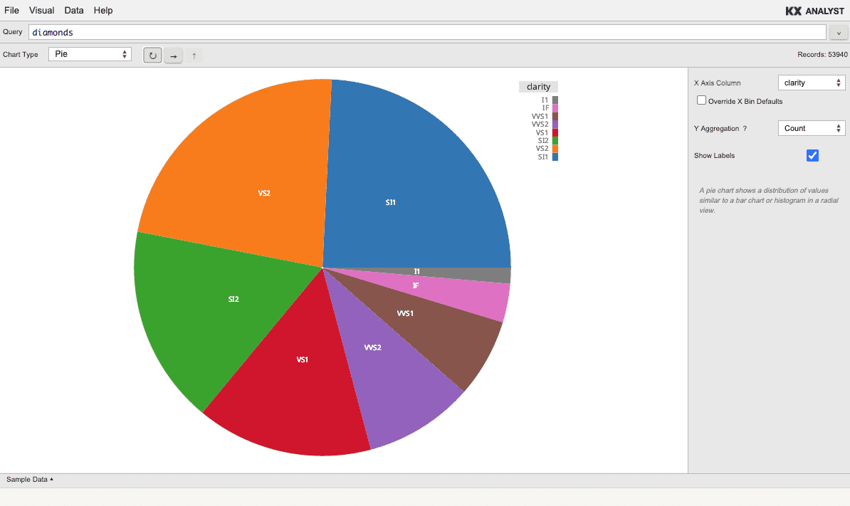
Pie
A pie chart shows a distribution of values similar to a bar chart or histogram in a radial view.
Pie charts are binned and can depict either count, or a variety of aggregations. Use a
First aggregation if the data is pre-aggregated to select the first value associated with
each category.
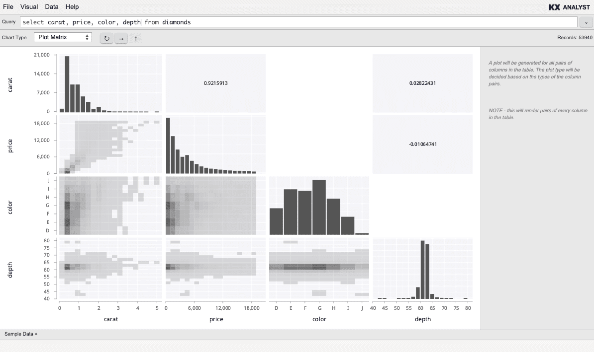
Plot Matrix
A plot matrix renders every column of the table. If n columns exist, a n*n chart will be displayed. The diagonal of the chart is a single Histogram for each column. Every cell not in the diagonal is a pairing of the two columns along the diagonal that define its coordinate. Note, it is a good idea to use this chart only on tables with few columns since each additional column requires more render time, and produces a smaller chart in each cell of the matrix.
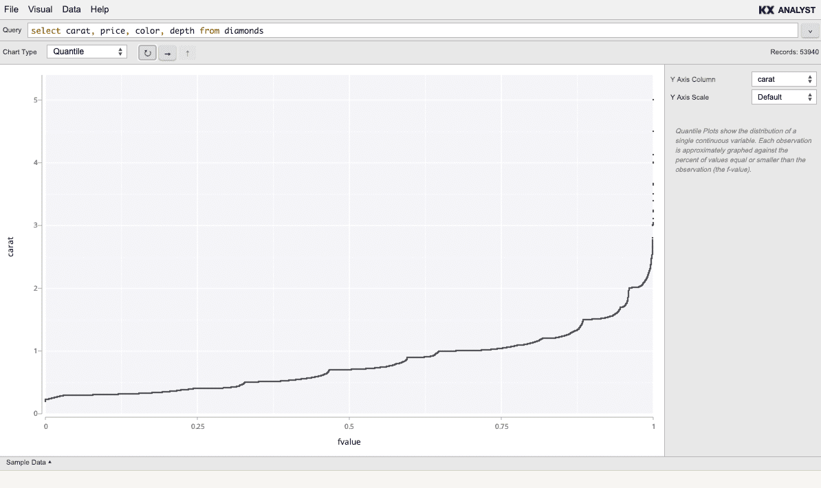
Quantile
Quantile shows the quantile of each value of a single column. The value is specified on the Y axis, and the quantile on the X axis.
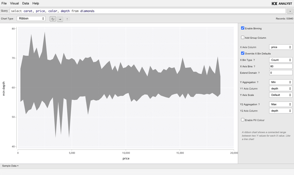
Ribbon
A ribbon chart shows a connected range between two Y values for each X value. Like a line chart, a ribbon chart is most often useful for numeric or temporal X domains, where an interval chart would be used for categorical X domains.
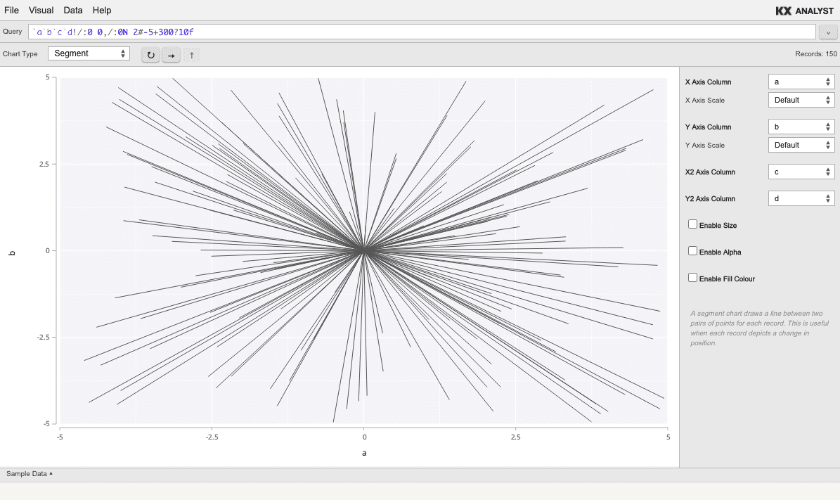
Segment
A segment chart draws a line between two pairs of points for each record. This is useful when each record depicts a change in position.