Data Grid
A Data Grid
The key element is the data source, where the query or analytic is defined.
The Data Grid also has settings for search, filtering, editing cells, insert and delete rows, sorting, grouping and custom column display.
Set up
-
Assign a data source.
-
Select filtering option to use.
-
Format your column data; use the Multi-Column Editor to make shared changes across columns.
Basics
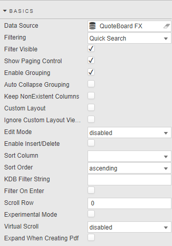
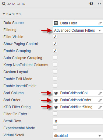
- Data Source
- Data sources
- Filtering
-
Three options:
option effect Quick Search Global search of all data columns; e.g. for selected text, number, date or time 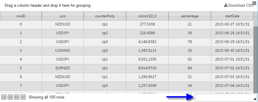
Column Filters Search on selected column. Additional filter options available with custom filters. 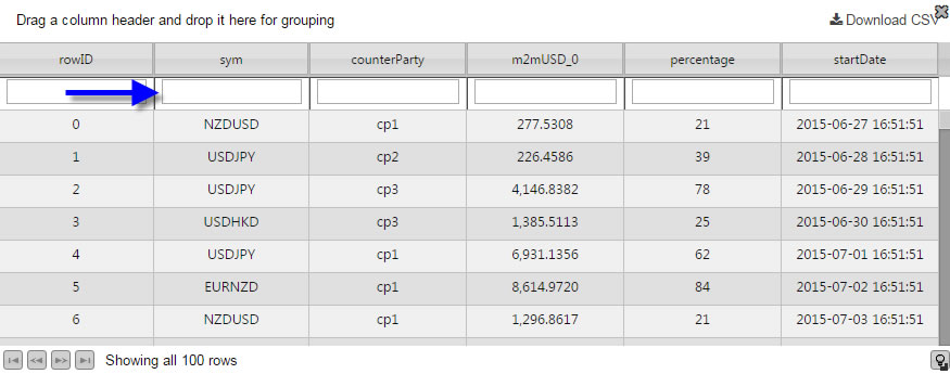
Advanced Column Filters Search on selected column, support for boolean operators AND,OR,-(NOT), and*(wildcard all).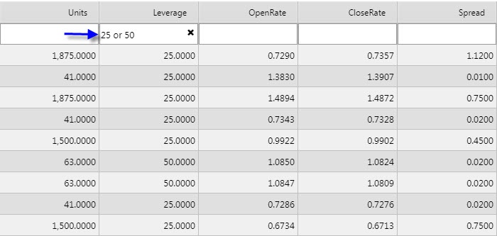
Disabled No filters -
Advanced Column Filters
option effect * Wild card, returns everything AND Searching for J AND Mwould return a Jim but not a John or MaryOR Search for J OR Mwould return a Jim, John and Mary- Acts as a NOT. Search for * -Jim -Johnwould return all bar Jim and Mary -
Advanced Column Filtering is not available for columns using custom filters.
-
Advanced Column Filtering can also used with server side filtering.
- Show Paging Control
-
When checked, displays pagination controls: used for large data sets

- Enable Grouping
- When checked, users can group data together: subtotals can be applied with Summary Row For Groupings
- Auto Collapse Grouping
- When checked, the dashboard is loaded with Data Grid groupings in collapsed form. Grid groupings are configured in Grouping Columns
- Keep NonExistent Columns
-
Non-existent columns are employed when working with a large number of queries. If a Data Source is changed, the prior column configurations from the original will be kept if this control is checked.
Dynamic queries
Dynamic queries which don’t have fixed column definitions can set Keep NonExistent Columns to retain configuration options; e.g. column formatting. In this scenario, the
*wildcard would be used in the Data Field Name. Hybrid wildcard usage is also supported; for example 'Data*' will return all columns with 'Data'. - Custom Layout
-
When checked, the Data Grid will have a button to summon the Configuration dialog.
The Configuration dialog lets users change the display of columns in the Data Grid.
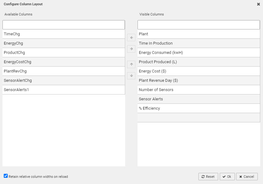
Configuration dialogAll columns are available to users
Hidden columns will be visible in the Available Columns list. This may not be desirable if a hidden column stores a calculation or highlight rule operator. In such instanced it may be necessary to disable Custom Layout.
User configuration is saved on exiting the dashboard and will be available on next login.
- Retain Relative Column Widths on Reload
- Check control to continue with relative width on display columns (relative widths are applied only when columns fit allocated horizontal space - when horizontal scrollbar is not visible)
- Ignore Custom Layout Viewstate
- When checked, if there is a viewstate defined in the column properties then it ignores this value when applying user defined custom layouts.
- Edit Mode
-
One of enabled, disabled, or instant. When enabled, a user can edit data by clicking the Edit button in the top-right corner, making each cell editable. When instant, boolean values in the table will be rendered as checkboxes that the user can toggle to instantly edit.
 Editing data with Edit Mode = enabled
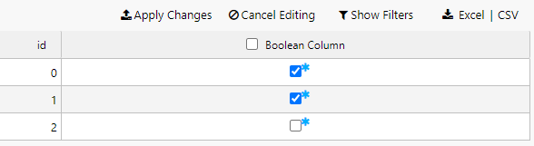
Editing data with Edit Mode = instant
In both cases, an update query must be used.
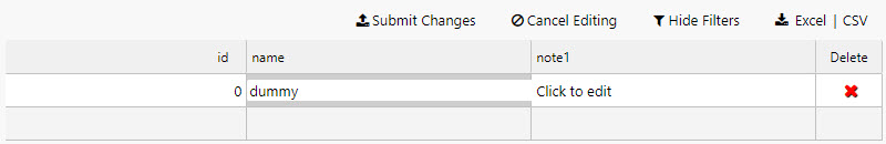
- Enable Insert/Delete
- Only used with an update query.
- Sort Column
- Sort Order
- Define which column, and direction, to sort data on dashboard load
- KDB Filter String
- Used in server side filtering.
- Filter on Enter
- When checked, user will have to press ENTER to return a filter result. Default behavior is to smart filter on typing.
- Scroll Row
- Stores a scroll value required for PDF Creation
- Experimental Mode
- Improved data handling efficiency and performance with high volume data
- Virtual Scroll
- Default is
disabled; all data is loaded to the dashboard from the Data Source. When enabled, viewed data is loaded as required; for streaming or frequently changing data and update queries,uncachedis recommended,cachedenables backend data management. - Expand When Creating Pdf
-
When checked, datagrid will be printed on multiple pages
Limitations
Datagrid has to be placed inside Tab Control. If header is present, it will be printed on each page. Grouping is not supported.
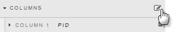
Columns
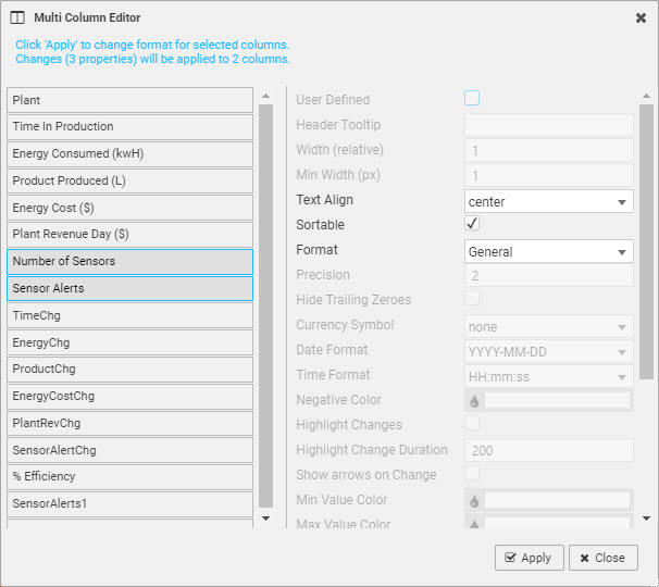
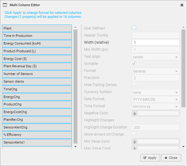
Besides individual column settings, settings for all columns can be defined in the Multi Column Editor:
Select columns on the left using Ctrl-click on columns.
Next select properties (settings) on the right to be applied across the selected columns.
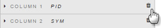
Columns can be removed from a Data Grid by clicking the trashcan icon
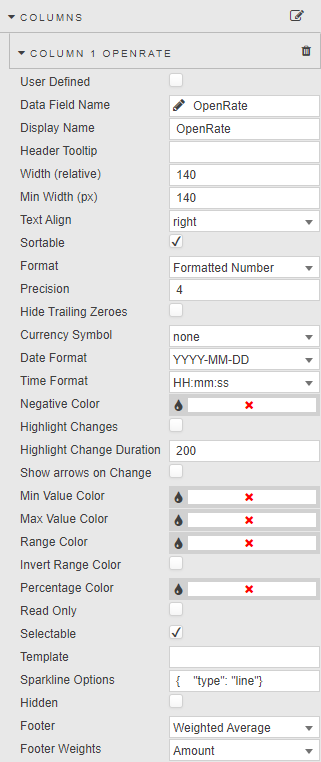
Column
Defines how data is formatted in each column.
- User Defined
-
When checked, the selected column will remain in the Data Grid if the selected column variable is removed from the query. A User Defined query is effectively a 'lock' on the column
User Defined checked for missing Data Source variable
The User Defined column will show as an empty column in the Data Grid if the User Defined column variable is missing in the query.
- Data Field Name
-
A column or dynamic column from the Data Source
Dynamic column syntax
use * or regex (e.g. CPUCore*, FXpair*EUR, /symbol|sym/i )
- Display Name
-

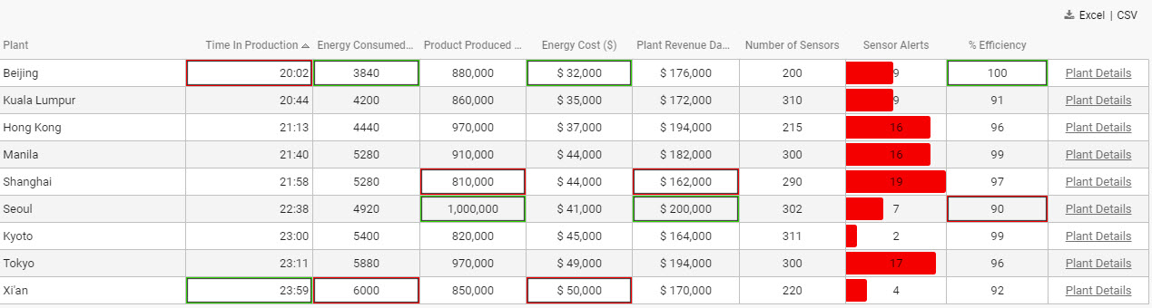
Columns with Display Names: Symbol, Counter Party, %, and Start DateWildcard '*' usage
Display Name is set to wildcard when Data Field Name uses the wildcard. Hybrid names using a mix of name label and wildcard are also supported; for example, Data Field Name set to 'Data*' with Display Name of 'Result *' will return columns including 'Data' with 'Result ' in the Display Name.
- Header Tooltip
- Provides a rollover text description for the column; useful if existing column title is clipped on browser resize.
- Width (relative)
-
Column width relative to other columns, e.g. columns with a relative width of 20, 10, 5, 1 will scale to column widths of 55% (i.e. 20/(20+10+5+1)), 28%, 14% and 3%
Columns will resize with the browser window.
- Min Width (px)
-
Pixels: the minimum width for a column
Using Width (relative) and Min Width (px) together
Width (relative) uses a default value based on the data Type in the column; in the case of a Data Grid the default Width (relative) and Min Width(px) are the same. There are two priority rules for Width (relative) and Min Width (px):
- If the screen is resized so that a scroll bar appears, Width (relative) will be disabled and only Min Width (px) used. If a further resize removes the scrollbar, Width (relative) will again be applied.
- If the Width (relative) is set to zero, only Min Width (px) will be applied.
If Width (relative) (irrespective of scrollbar) narrows Data Grid column widths to less than Min Width (px), then Min Width (px) will be used.
Group apply Width changes
When using Width (relative) or Min Width (px) it may be helpful to use the bulk parameter adjuster; click

Ctrl+select the columns to change, then adjust the required parameter(s) to have the value applied to all selected columns
- Text Align
- Horizontal alignment of values in their cells
- Sortable
-
When checked, clicking on column header will toggle between ascending and descending sorts
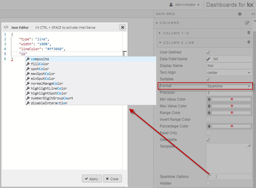
- Format
- for the data in the column, e.g.
DateTime,Percentage,Sparkline - Precision
- The number of decimal places show for numeric data
- Hide Trailing Zeroes
- When checked, suppresses trailing zeroes for numeric data
- Currency Symbol
Columns with prefixed currency symbols- Date Format
- Time Format
- Where Format is Date, Time, or DateTime the data is formatted with these two settings
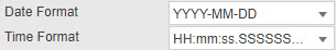
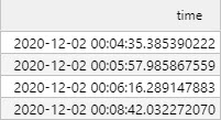
Date Format, Time Format, and a formatted DateTime column- Negative Color
- Set color for negative values in column
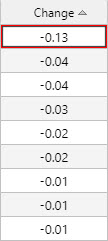
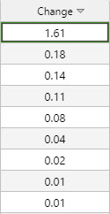
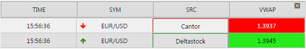
- Highlight Change
- When Highlight Changes is enabled, higher than previous value changes will be highlighted in green and lower values in red. The length of time for the highlight is set by Highlight Change Duration
- Highlight Rules
- Highlighting highs, lows and ranges
-
Checkboxes Highlight Min Value, Highlight Max Value, and Range Highlight apply colors to highlight values:
Columns with Min Value Color, Max Value Color, and Range Color applied - Invert Range Color
- Flip range color usage; dark shade for high values, light shade for low values
- Percentage Color
-
A color, used for mini-bars when Format is Percentage
Colors can be View State Parameters
Min Value Color, Max Value Color, Range Color, and Percentage Color can be View State Parameters.
- Read Only
- When checked, the column cannot be edited
- Selectable
- Checked by default; column cells cannot be selected when unchecked
- Template
- Apply HTML customizations with Handlebar helpers; for example:
<font color="blue">{{column name}}</font>-
where
{{column name}}is the reference name for the column from the data source. - Sparkline Options
- Configuration for Sparklines
- Hidden
- Data column is hidden.
- When Hidden columns are no longer hidden
If Full Excel Export is enabled, all Hidden columns will be downloaded as part of the export. Hidden columns are also available under Custom Layout. - Footer
-
Adds a column sub-total value for
weighted average,average,count,sumornone.
- Footer Weight
- Applies a weighting to current column by selected data source variable. For this to be enabled, Footer must be set to
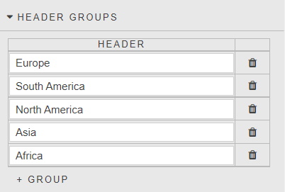
weighted average. - Header
-
Applies a column grouped header.
Note
Auto size applied on grouped header when user resize columns. Column reorder restricted within its group.
Selection & Routing
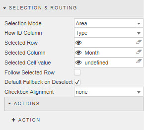
- Selection Mode
- Select from
Area,Single Row,Multi RoworCell - Row ID Column
- Define from the data source
- Selected Row
- Selected Column
- Selected Cell Value
- Assign view state parameters to each attribute when
Cellis selected. - Follow Selected Value
- When checked, row selection highlight will retain view on screen during scroll event
- Default Fallback on Deselect
- When checked, default View State Parameter values will be used (if set) in the absence of a row select
- Checkbox Alignment
- Position of data row selection check boxes; select from
none,leftorright
Keyboard Shortcuts
A set of keyboard shortcuts for Selection Mode Area; allows for bulk selection of cells and rows.
| shortcut | description |
|---|---|
| Shift + End | Select to end of column from cell |
| Shift + Home | Select to top of column from cell |
| Shift + Page Up | Select from cell to each page up instance |
| Shift + Page Down | Select from cell to each page down instance |
| Shift + Click | Select from cell to click-select-cell |
| Drag-select-rows | Select multiple rows |
Action
File export
Tooltip
- Position
- Select from
none,right,left,cursor - Template
- Templates
- Use Formatted Cell Value
- When the "Use Formatted Cell Value" property is checked then tooltip uses the formatted value from column template otherwise if unchecked uses the raw cell value.
Grouping columns
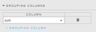
A Grouping Column groups Data Grid rows by their values in that column. Specifying further grouping columns repeats this within each group.
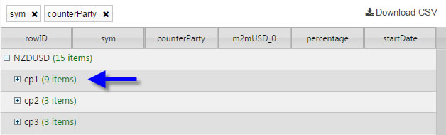
Grouping by sym and counterParty
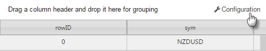
Dashboard users can also create groupings on the fly by dragging a column header into the space directly above the column headers:
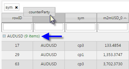
Dragging a column header to set a grouping column
Summary Row for Groupings
Grouping Columns reorganises the Data Grid layout. Summary Row for Groupings adds simple mathematical calculations to the groups.
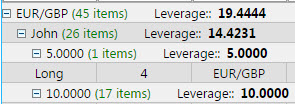
‘Leverage’ calculated for each group
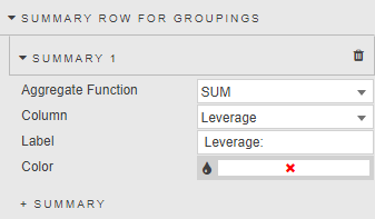
- Aggregate Function
- The mathematical function to apply:
average,sum,min,maxorweighted average(extra column will appear) - Column
- The column on which the calculations will be made
- Label
- The text label to use for the calculation
- Color
- The font color for the grouping
Highlight rules
Mark changes in data grid values with color; select between Gradient or monotone Discrete colors.
Highlight Rules in operation
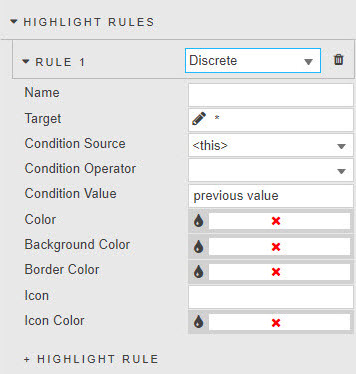
- Name
- The name of the rule
- Target
- The column on which the rule will act. Can be any column in the Data Grid: does not have to be the column using the operator.
- Condition Source
- Condition Operator
- Condition Value
- Discrete highlight rule Highlight Rules
- Rule Min
- Rule Max
- Rule Limit
- Gradient highlight rule. Rule Limit restricts highlights to values between Rule Min and Rule Max only; values outside of this range have no highlights applied. Use
Color Paletteto define gradient color highlights. - Color
- The text color when rule is true
- Background Color
- Background cell color when rule is true
- Border Color
- Cell border color when rule is true
- Icon
- Icon to appear when rule is true
- Icon Color
- Color for the icon (if used) when rule is true
- Apply Palette To
- Gradient highlight colors applied to
background,text,borderoricon
Color Palette
Define colors used by Gradient highlight; low to high values, top to bottom.
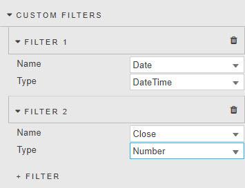
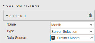
Custom filters
Introduce client-side advanced filters for columns covering text, numeric and datetime formats.
Custom Filters are available only when Filtering is set to Column Filters or Advanced Column Filters.
Filtering is only applied to viewable data; paging will limit results to current page.
Custom Filters
Select a custom filter for each columns
| filter | description |
|---|---|
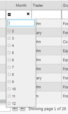
| Selection | Filter dropdown; check available data options to display. |
| Server Selection | Server Selection Filtering |
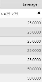
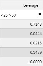
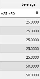
| Number | Support for filter options: <, >, >=, <=, =, ==, != (exclude) |
| Date Time | Select for Date or Time using standard operators: <, >, >=, <=, = |
| Disabled | No filtering |
Examples:
- Symbol starts with
EURorUSD: 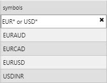
- Symbol starts with
EUR, withoutEURAUD: 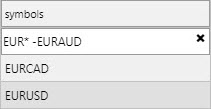
- Symbol starts with
EUR, withoutEURAUDandEURCAD: 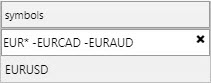
- Symbol ends with
CAD: 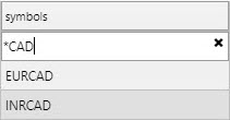
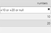
- Selected numbers:
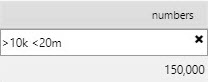
- Range between 10000 and 20000000:
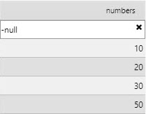
- Ignore null values:
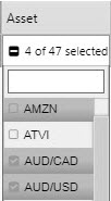
- Selecting Four symbols
- Range between 25 and 75
- Range outside 25 and 50
- Return 25 and 50 only
Filtering variables with !=
When the exclusion function != is used, all values – including column cells with null data – will be returned with the exception of the value defined by !=
Server selection filtering
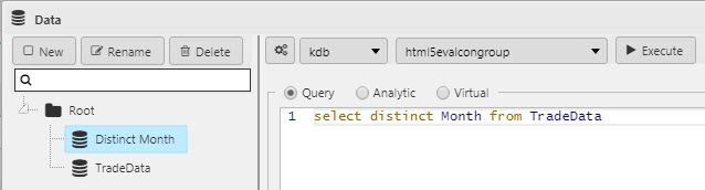
Server selection should be used when data is not fully loaded to the client; for example, when using server-side paging or Server-side Filtering via the KDB Filter String.
Server selection uses a data source to return all member items of the filtered column.
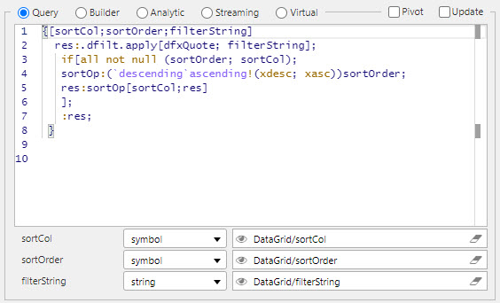
Server-side filtering
-
Set Filtering to Column Filters or Advanced Column Filters.
-
Create three view state parameters for Sort Column, Sort Order and KDB Filter String; these can be grouped in the view state parameter menu. View states for Sort Column and Sort Order are of string or symbol. The KDB Filter String must be of type string.
-
Define a data source to be filtered. The following code snippet uses
dfxQuoteas the target data set; replace as appropriate:
{[sortCol;sortOrder;filterString] res:.dfilt.apply[dfxQuote; filterString]; if[all not null (sortOrder; sortCol); sortOp:(`descending`ascending!(xdesc; xasc))sortOrder; res:sortOp[sortCol;res] ]; :res; }-
Header Groups
- A Header Group defines a potential groupped header that can be applied to a column
-
Style
Style for common settings
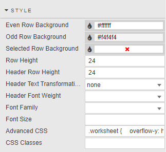
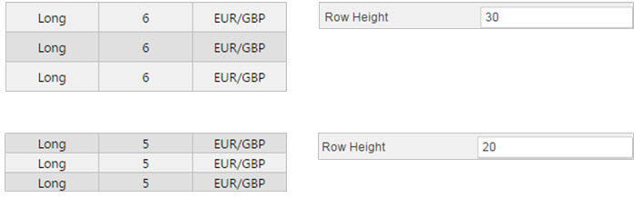
- Header Row Height
- Row Height
- Even Row Background & Odd Row Background
- Background colors of the even and odd rows
- Selected Row Background
- When Enable Row Selection is checked, the background color of the selected row
- Header Text Transformation
- Text transformation for column headers
- Header Font Weight
- Font weight for column header
- Font Family
- Font family for column headers and rows
- Font size
- Font size for rows (css format), e.g.
18px,0.8em,80%,larger
Advanced CSS
Sparklines
To display Sparklines, set Column Format to Sparkline and modify Sparkline Options using JSON editor
Query example for Line chart ([] ix:til 100; list:{(60?30)}each 1_til 101)
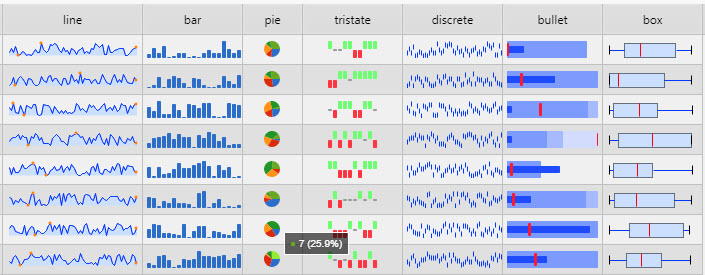
These chart types are supported: line, bar, pie, tristate, discrete, bullet, box
Composite sparklines
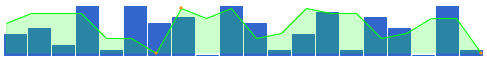
([] twoDatasets: {((20?10);(20?10))}each 1_til 101)[{
"type": "bar",
"height": 50,
"barWidth": 23
},
{
"type": "line",
"composite": true,
"fillColor": "rgba(0,255,0, 0.2)",
"lineColor": "#00ff00"
}]Common options
These options can be set for most of the supported chart types.
| option | semantics |
|---|---|
| type | One of line (default), bar, tristate, discrete, bullet, pie or box. |
| width | Width of the chart: defaults to auto. May be any valid CSS width: 1.5em, 20px, etc. (Using a number without a unit specifier won’t do what you want.) This option does nothing for bar and tristate chars (see barWidth). |
| height | Height of the chart. Defaults to auto: line height of the containing tag. |
| lineColor | Used by Line and Discrete charts to specify the color of the line drawn as a CSS values string. |
| fillColor | Specify the color used to fill the area under the graph as a CSS value. Set to false to disable fill. |
| chartRangeMin | Specify the minimum value to use for the range of Y values of the chart. Defaults to the minimum value supplied. |
| chartRangeMax | Specify the maximum value to use for the range of Y values of the chart. Defaults to the maximum value supplied. |
| composite | If true then don’t erase any existing chart attached to the tag, but draw another chart over the top. Width and height are ignored if an existing chart is detected. NB: You’ll usually want to lock the axis on both charts using chartRangeMin and chartRangeMax if you want the same value on each chart to occupy the same point. |
| enableTagOptions | If true then options can be specified as attributes on each tag to be transformed into a sparkline, as well as passed to the sparkline() function. See also tagOptionPrefix. |
| tagOptionPrefix | String that each option passed as an attribute on a tag must begin with. Defaults to spark. |
| tagValuesAttribute | The name of the tag attribute to fetch values from, if present: defaults to values. |
| disableHiddenCheck | Set to true to disable checking for hidden sparklines. This can be beneficial if you know you’ll never attempt to draw a sparkline into a hidden parent element, as it avoids a browser reflow for the test, increasing rendering performance. Defaults to false. |
Range maps
Several parameters, such as colorMap and tooltipLookupValues, accept a range map as a parameter. As the name suggest, it maps ranges of numbers to values. For example:
{
    1: "red",
    "2:9": "yellow",
    "10:": "red"
}Line charts
Line charts are the default chart type, but to specify the type explicitly set an option called type to line.
| option | semantics |
|---|---|
| defaultPixelsPerValue | Defaults to 3 pixels of width for each value in the chart. |
| spotColor | The CSS color of the final value marker. Set to false or an empty string to hide it. |
| minSpotColor | The CSS color of the marker displayed for the mimum value. Set to false or an empty string to hide it. |
| maxSpotColor | The CSS color of the marker displayed for the maximum value. Set to false or an empty string to hide it. |
| spotRadius | Radius of all spot markers, in pixels (default: 1.5). |
| valueSpots | Specifies which points to draw spots on, and with which color. Accepts a range. For example, to render green spots on all values less than 50 and red on values higher use {":49": "green", "50:": "red"} |
| highlightSpotColor | Specifies a color for the spot that appears on a value when moused over. Set to null to disable. Defaults to #f5f. |
| highlightLineColor | Specifies a color for the vertical line that appears through a value when moused over. Set to null to disable. Defaults to #f22. |
| lineWidth | In pixels (default: 1) – Integer |
| normalRangeMin, normalRangeMax | Specify threshold values between which to draw a bar to denote the ‘normal’ or expected range of values. For example the green bar might denote a normal operating temperature range |
| drawNormalOnTop | By default the normal range is drawn behind the fill area of the chart. Setting this option to true causes it to be drawn over the top of the fill area |
| xvalues | See below |
| chartRangeClip | If true then the Y values supplied to plot will be clipped to fall between chartRangeMin and chartRangeMax. By default chartRangeMin/Max just ensure that the chart spans at least that range of values, but does not constrain it. |
| chartRangeMinX | Specifies the minimum X value of the chart |
| chartRangeMaxX | Specifies the maximum X value of the chart |
See also all of the common options above, that can also be used with line charts
By default the values supplied to line charts are presumed to be y values mapping on to sequential (integer) X values. If you need to specify both the X and Y values for your chart, use an array of arrays: ((1; 3); (2; 4); (5; 3))
You can also specify a value of null to omit values from the chart completely.
Bar charts
(10; 8; 9; 3; 5; 8; 5)
Set the type option to bar to generate bar charts. Values can be omitted by using the null value instead of a number.
| option | semantics |
|---|---|
| barColor | CSS color used for positive values. |
| negBarColor | CSS color used for negative values. |
| zeroColor | CSS color used for values equal to zero. |
| nullColor | CSS color used for values equal to null. By default, null values are omitted entirely, but setting this adds a thin marker for the entry. This can be useful if your chart is pretty sparse: perhaps try setting it to a light gray or something equally unobtrusive. |
| barWidth | Width of each bar, in pixels (integer). |
| barSpacing | Space between each bar, in pixels (integer). |
| zeroAxis | Centers the Y-axis at zero if true (default). |
| colorMap | A range map to map specific values to selected colors. For example if you want all values of -2 to appear yellow, use colorMap: { "-2": "#ff0" }. You may also pass an array of values here instead of a mapping to specify a color for each individual bar. For example if your chart has three values 1, 3, 1 you can set colorMap=["red", "green", "blue"] |
| stackedBarColor | An array of colors to use for stacked bar charts. The first series will use the first value in the array, the second series will use the second, etc. |
See also all of the common options above, that can also be used with bar charts
Version 2.0 adds support for stacked bar charts. Values for each data series in the chart can be separated by colons if passed by HTML, or as an array of arrays.
For example, to draw series one with values of 1,2,3,4 and series 2 with values of 4,3,2,1:
((1; 4); (2; 3); (3; 2); (4; 1))
Tristate charts
(1; 1; 0; 1; -1; -1; 1; -1; 0; 0; 1; 1)
Tri-state charts are useful to show win-lose-draw information, such as the SF Giants recent game results above. You can also use the colorMap option to use different colors for different values, or for arbitrary positions in the chart.
Set the type option to tristate to generate Tristate charts.
| option | semantics |
|---|---|
| posBarColor | CSS color for positive (win) values. |
| negBarColor | CSS color for negative (lose) values. |
| zeroBarColor | CSS color for zero (draw) values. |
| barWidth | Width of each bar, in pixels (integer). |
| barSpacing | Space between each bar, in pixels (integer). |
| colorMap | A range map to map specific values to selected colors. For example if you want all values of -2 to appear yellow, use colorMap: { "-2": "#ff0" }.As of version 1.5 you may also pass an array of values here instead of a mapping to specifiy a color for each individual bar. For example if your chart has three values 1, 3, 1 you can set colorMap=["red", "green", "blue"]. |
See also all of the common options above, that can also be used with Tristate charts
Discrete charts
(4; 6; 7; 7; 4; 3; 2; 1; 4; 4; 5; 6; 7; 6; 6; 2; 4; 5)
Discrete charts provide a separated thin vertical line for each value.
Set the type option to discrete to generate Discrete charts.
| option | semantics |
|---|---|
| lineHeight | Height of each line in pixels. Defaults to 30% of the graph height. |
| thresholdValue | Values less than this value will be drawn using thresholdColor instead of lineColor |
| thresholdColor | Color to use in combination with thresholdvalue`. |
See also all of the common options above, that can also be used with discrete charts
Bullet graphs
(10; 12; 12; 9; 7)
Supplied values must be in this order: target, performance, range 1, range 2, range 3, …
Set the type option to bullet to generate Bullet graphs.
| option | semantics |
|---|---|
| targetColor | The CSS color of the vertical target marker. |
| targetWidth | The width of the target marker in pixels (integer). |
| performanceColor | The CSS color of the performance measure horizontal bar |
| rangeColors | Colors to use for each qualitative range background color. This must be a JavaScript array, e.g. ["red","green", "#22f"]. |
See also all of the common options above, that can also be used with bullet charts
Pie charts
(1; 1; 2)(20; 50; 80)
Set the type option to pie to generate Pie charts.
These little pie charts tend only to be useful only with 2 or 3 values at most.
| option | semantics |
|---|---|
| sliceColors | An array of CSS colors to use for pie slices. |
| offset | Angle in degrees to offset the first slice. Try -90 or +90. |
| borderWidth | Width of the border to draw around the whole chart, in pixels. Defaults to 0 (no border). |
| borderColor | CSS color to use to draw the pie border. Defaults to #000. |
See also all of the common options above, that can also be used with Pie charts
Box plots
(4; 27; 34; 52; 54; 59; 61; 68; 78; 82; 85; 87; 91; 93; 100)
Set the type option to box to generate Box plots.
| option | semantics |
|---|---|
| raw | If set to false (default) then the values supplied are used to calculate the box data points for you. If true then you must pre-calculate the points (see below). |
| showOutliers | If true (default) then outliers (values > 1.5 × the IQR) are marked with circles and the whiskers are placed at Q1 and Q3 instead of the least and greatest value. |
| outlierIQR | Set the inter-quartile range multipler used to calculate values that qualify as an outlier. Defaults to 1.5. |
| boxLineColor | CSS line color used to outline the box. |
| boxFillColor | CSS fill color used for the box. |
| whiskerColor | CSS color used to draw the whiskers. |
| outlierLineColor | CSS color used to draw the outlier circles. |
| outlierFillColor | CSS color used to fill the outlier circles. |
| spotRadius | Radius in pixels to draw the outlier circles. |
| medianColor | CSS color used to draw the median line. |
| target | If set to a value, then a small crosshair is drawn at that point to represent a target value. |
| targetColor | CSS color used to draw the target crosshair, if set. |
| minValue | If minvalue and maxvalue are set then the scale of the plot is fixed. By default minValue and maxValue are deduced from the values supplied. |
| maxValue | See minValue. |
See also all of the common options above, that can also be used with Box plot charts
As noted in the options above, by default raw is set to false. This means that you can just pass an arbitrarily long list of values to the sparkline function and the corresponding box plot will be calculated from those values. This is probably the behavior you want most of the time.
If, on the other hand, you have thousands of values to deal with you may want to pre-compute the points needed for the Box plot. In that case, set raw=true and pass in the computed values. If showing outliers, supplied values of:
low_outlier, low_whisker, q1, median, q3, high_whisker, high_outlier.
Omit the outliers and set showOutliers to false to omit outlier display.
Interactive sparklines
Version 2.0 of the plugin introduces support for interactive sparklines in the form of tooltips, mouseover highlighting and click interaction for all supported types of sparkline.
If you’re happy with the default look and feel of the tooltips, you can skip this entire section.
Options to control sparkline interactions:
| option | semantics |
|---|---|
| disableInteraction | Set to true to disable all sparkline interactivity, making the plugin behave in much the same way as it did in 1.x Defaults to false. |
| disableTooltips | Set to true to disable mouseover tooltips. Defaults to false. |
| disableHighlight | Set to true to disable the highlighting of individual values when mousing over a sparkline. Defaults to false. |
| highlightLighten | Controls the amount to lighten or darken a value when moused over. A value of 1.5 will lighten by 50%, 0.5 will darken by 50%. Defaults to 1.4. |
| highlightColor | If specified, then values that are moused over will be changed to this color instead of being lightened. |
| tooltipClassname | Specifies a CSS class name to apply to tooltips to override the default built-in style. |
| tooltipOffsetX | Specifies how many pixels away from the mouse pointer to render the tooltip on the X axis. |
| tooltipOffsetY | Specifies how many pixels away from the mouse pointer to render the tooltip on the Y axis. |
| tooltipChartTitle | If specified then the tooltip uses the string specified by this setting as a title. |
| tooltipFormat | A format string or spformat object (or an array thereof for multiple entries) to control the format of the tooltip. |
| tooltipPrefix | A string to prepend to each field displayed in a tooltip. |
| tooltipSuffix | A string to append to each field displayed in a tooltip. |
| tooltipSkipNull | If true then null values will not have a tooltip displayed Defaults to true. |
| tooltipValueLookups | An object or range map to map field values to tooltip strings. For example you may want to map -1, 0 and 1 to the strings Lost, Draw, Won. |
| tooltipFormatFieldlist | An array of values specifying which fields to display in a tooltip and in what order. Currently only useful for Box plots. See below for more details. |
| tooltipFormatFieldlistKey | Specifies which key holds the field name to reference above. For Box plots this should be field. |
| numberFormatter | Pass a JavaScript function to control how numbers are formatted in tooltips. The callback will be passed a number to format and must return a string. Default behavior is to format numbers to Western conventions. |
| numberDigitGroupSep | Character to use for group separator in numbers 1,234 for L10n purposes. Defaults to the comma ,. |
| numberDecimalMark | Character to use for the decimal point in numbers for L10n purposes. Defaults to the period .. |
| numberDigitGroupCount | Number of digits between the group seperator in numbers for L10n purposes. Defaults to 3. |
Formatting tooltips
The tooltipFormat and tooltipValueLookups options provide the main methods of formatting the text displayed for each value in a toolip.
The tooltipFormat is applied whenever the mouse is moved over a value. Various fields enclosed between double curly braces in the format string are substituted depending on the type of sparkline in use. For example, the default format string for line charts is:
{{prefix}}{{y}}{{suffix}}color is derived from the color of the line being drawn.
prefix and suffix and set by setting the tooltipPrefix and tooltipSuffix items.
y represents the Y value of the point under the mouse. x can also be used if useful.
The supported fields for the different types of sparklines include:
- All types:
prefix,suffixas set bytooltipPrefixandtooltipSuffixoptions - Line:
color,fillColor,x,y,isNull(true if a null value) - Bar:
value(the value under the pointer),color,isNull - Tristate:
value(the value under the pointer),color,isNull - Discrete:
value,isNull - Pie:
value,percent(number between 0 and 100),color(of the moused-over slice)` - Bullet:
value,fieldkey,isNull - Box:
fieldandvalue. Field may be one oflq(lower quartile),med(median),uq(upper quartile),lo(left outlier),ro(right outlier),lw(left whisker)rw(right whisker)