Button
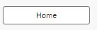
A Button
Set up
-
Create a Label for your button.
-
Create the action or actions you want the button to control on click.
Action
Basics
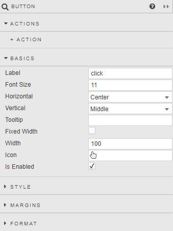
- Label
- Name to appear on the button
- Font Size
- Size of button font in pixels
- Horizontal
- Alignment of text inside the button
- Vertical
- Alignment of text inside the button
- Tooltip
- Descriptive tooltip to appear on button rollover
- Button width
- When Fixed Width is checked, the buton is Width pixels wide, otherwise button fills width of the Button component
- Icon
- Select from list of icons to include in the button
- Is Enabled
- Control whether a button is active or inactive; can be associated with a boolean Type View State Parameter
Style, Margins, Format
Style for common settings
Style
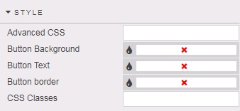
- Button Background
- Select color for button background
- Button Text
- Select color for button text
- Button Border
- Select color for button border