Action Tracker
Action Tracker is a self-contained alerting application and is used by Stream for KX.
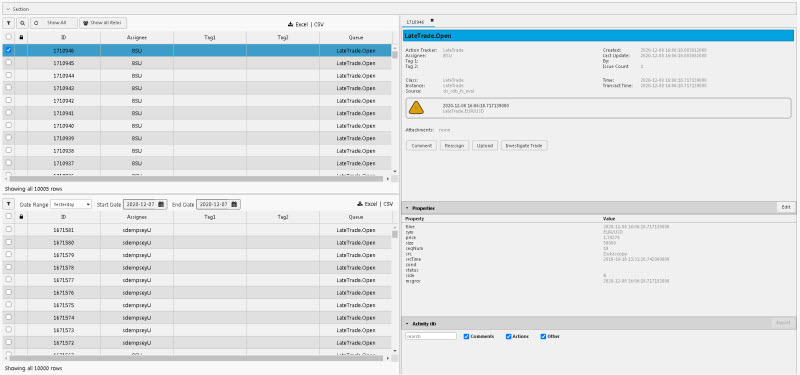
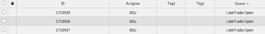
Action Tracker with horizontal layout
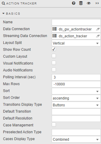
Basics
- Name
- A name for the component provided by the user.
- Data Connection
- Streaming Data Connection
-
Data connection
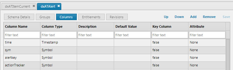
The connection is a very specific alert gateway process, querying real-time and historical alerts. Alerts are published into a fixed table
dxATAlertand the displayed table is kept indxATItemCurrent. A Data Source is not needed as all modification of the view lies within Dashboards.You can tick/untick the visible columns in the Style editor. There are some miscellaneous columns (
tag1,tag2, etc.) that you can populate freely and then change the column header within Dashboards if you want more customised information in your alert table. - Layout split
VerticalorHorizontal- Show Row Count
-
Displays number of data rows
- Custom Layout
-
Select display columns from available data columns. Hidden columns are excluded from the list of available columns.
- Visual Notifications
- Check for pop-up notification when new item added
- Audio Notifications
- Check for aural notification when new item added
- Polling Interval (sec)
- Set time check for new items
- Max Rows
- Set maximum display rows of items; default value of "0" shows all rows
- Transitions Display Type
-
Set the way transitions are displayed
- Grouped
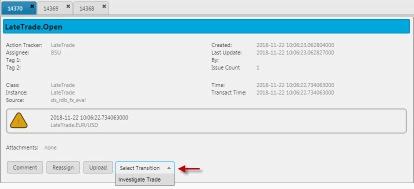
- Buttons
- Popup
- Default Transition
- Default Resolution
- Value to be selected (if available) when selecting transition
- Case Management
-
When enabled, allows users create an action case; actions are defined by Action Type Cases
Users can then configure the individual action
Case configuration
Ensure cases are specified in Action Type Cases
- Preselected Action Type
- Selected
Action Typevalue when creating a case - Cases Display Type
-
Sets the way alerts and cases are displayed
-
Combined- Data Grid displays both alerts and cases. -
Tabs- Alerts and cases are displayed in separate tabs. When selected, the Selected Tab option will be available.
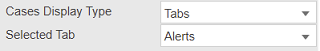
-
- Selected Tab
-
Determines the default Tab to be displayed when the Action Tracker is launched. This property is only available when the Cases Display Type property is set to a value of
Tabs.-
Alerts- DisplaysAlertstab when Action Tracker is launched. This is the default. -
Cases- DisplaysCasestab when Action Tracker is launched.
-
Columns
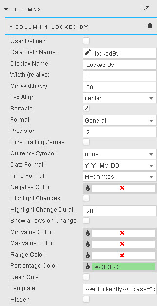
- User Defined
-
When checked, the selected column will remain in the Data Grid if the selected column variable is removed from the query. A user-defined query is effectively a ‘lock’ on the column
Watch out
If the User Defined column variable is missing in the query, the User Defined column will show as an empty column in the Data Grid
- Data Field Name
-
A Data Source column or a wildcard column
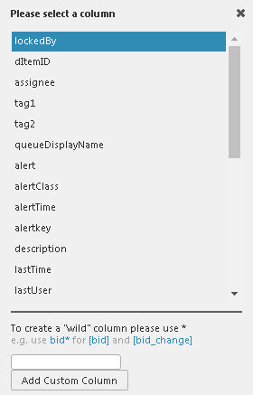
When using a wildcard, all dynamic columns derived from a query will use the wildcard column format. The wildcard can be used in conjunction with text headers; e.g.
bid*for bothbidandbid_update.Select the Data Field Name from data columns in the Data Source query.
Additional columns can be added, including wildcard columns. If a wildcard is used, any undefined columns will adopt the properties of the wildcard column; e.g. data alignment, decimal precision etc.
- Display Name

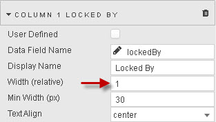
- Width (relative)
-
Relative to the width of the Data Grid. The scale is contingent on the values of each column; for example, columns with a relative width of 20, 10, 5, 1 will scale at a column width of 55% (i.e. 20/(20+10+5+1)), 28%, 14% and 3%.
Relative columns will scale according to the browser size.
- Minimum Width (pixels)
- Minimum width in pixels for a column. Columns with this set will scale according to browser size.
- Text Align
- Horizontal alignment of values within cells
- Sortable
-
When checked, users clicking on a column header will toggle between ascending and descending sort.
- Format
- Format for column data. If
DateTimeis selected, then either a Date Format or Time Format must also be selected. - Precision
- The number of decimal places to display for numeric data
- Hide Trailing Zeroes
- When checked, suppresses the display of trailing zeroes
- Currency Symbol
Columns with Currency Symbol prefixes- Date and time formats
-
Where Format is
DateTime, Date Format and/or Time Format specify the display format: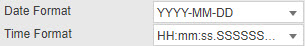
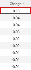
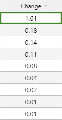
Date Format and Time Format combine to format a column of DateTime data - Negative Color
- Define color for negative values
- Highlight Changes
- Highlight Change Duration
- Show arrows on Change
- On change in column cell value, upward changes will highlight green and/or an up arrow, down in red and/or down arrow.
- Min Value Color
-
A color for a border highlight around the lowest value in the column
- Max Value Color
-
A color for a border highlight around the highest value in the column
- Range Color
-
A color to be applied as a value gradient across all cells in a column
- Percentage Color
-
A color to be applied as a mini-bar, where Format is
Percentage
View State Parameters as colors
Any of Min Color, Max Color, Range Color and Percentage Color can be a View State Parameter.
To assign a View State Parameter, roll over the end of the input bar until
 appears, then click to assign.
 - Read Only
- When checked, the column cannot be edited
- Template
- Templates
- Hidden
-
When checked, hides column
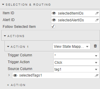
Selection & Routing
- Item ID
-
A View State Parameter of type list; supports multiple item selection in tabs.
New Action Tracker Instance
Ensure view state parameter is assigned.
- Alert ID
-
A View State Parameter of type GUID; populated with selected event content from Alerts dialog.
New Action Tracker Instance
Ensure view state parameter is assigned.
- Follow Selected Value
- Focuses grid selection to ItemID
Action
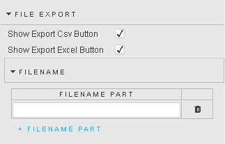
File Export
- Show Export CSV Button
- When checked, enables export of content as CSV
- Show Export Excel Button
- When checked, enables export of content in Excel format
- Filename
- Filename for export of CSV/Excel files
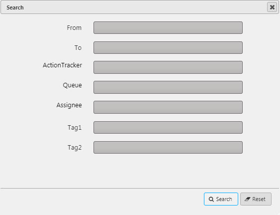
Filters
This defines which of the Action Tracker data columns (visible and hidden) are available to the user in Search. Values can be mapped to View State Parameters.
Filter
Define the characteristics for each search filter
- Name
- Selected Action Tracker data column
- Value
- Set value; for example, if using time use "lastTime". Can be linked to a View State Parameter
- Hidden
- Filter not available to user
- Filter Type
-
Sets the input;
Text,DropdownandData Source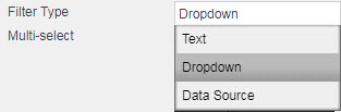
If using a
Data Sourceremember to assign Value and Text variables for the dropdown selection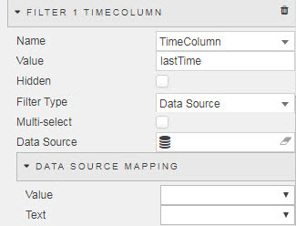
- Multi-select
- Allows for multiple input selections
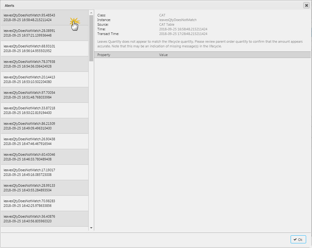
History
Displays historical alerts in separate panel
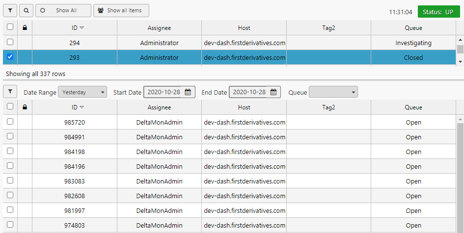
- Show History
- When checked, enables historical panel
- Row Height
- Set the row height
- Start Date
- End Date
- Date range to be applied at startup, use rolling View State Parameter of type Date (e.g. T-1)
Overrides
Filters applied to the main grid are also by default applied to the historical grid. This section helps to override those filters.
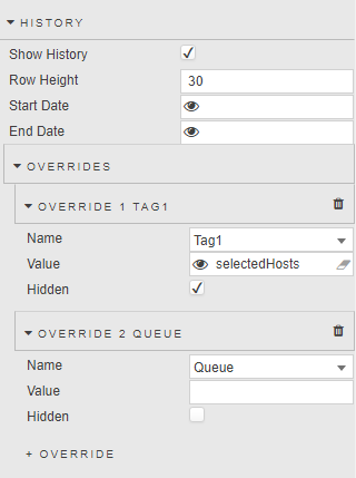
- Name
- Selected Action Tracker data column of filter to override
- Value
-
Set value; for example, keep value empty for "Assignee" to not apply the filter for assignee column (that is used in main grid).
Value can be linked to a View State Parameter ("Tag1"-value can be bound to a list of values selected and set via "Actions" in main grid)
- Hidden
- Filter override not displayed
Highlight Rules
Used to apply color updates to notify users of changes in grid values
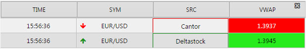
Highlight rules in operation
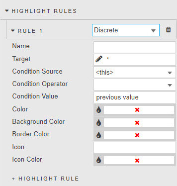
- Name
- Name of the rule
- Target
- The grid column to which the rule will apply. It can be any column; it does not have to be the Condition Source
- Condition
-
Data from the Condition Source (a Data Source column) is tested with the Condition Operator against the Condition Value – typically
previous value.The Condition Operator may be a numeric comparison, but can also test for strings in text values.
- Color
- The cell text color when the Condition rule is true
- Background Color
- The cell background color when the Condition rule is true
- Border Color
- The cell border-color when the Condition rule is true
- Icon
- An icon to appear when rule is true
- Icon Color
- The color for the icon (if used) when rule is true
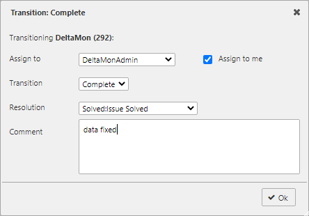
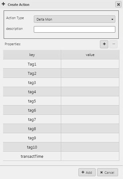
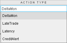
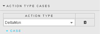
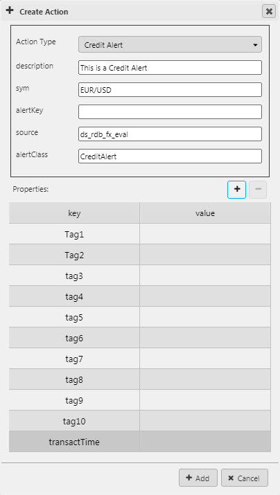
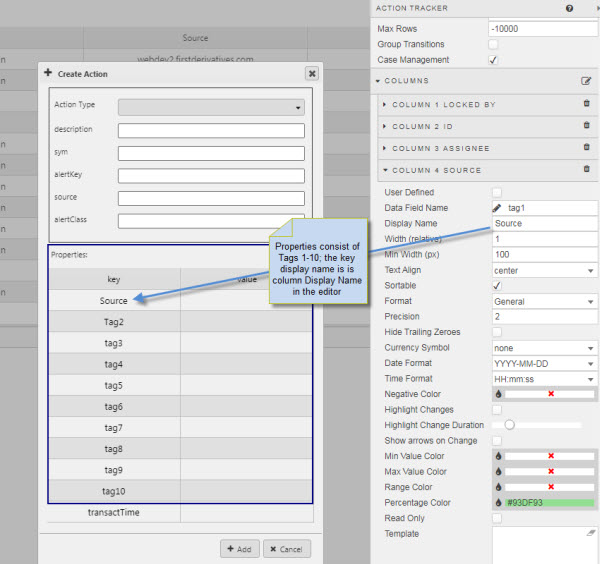
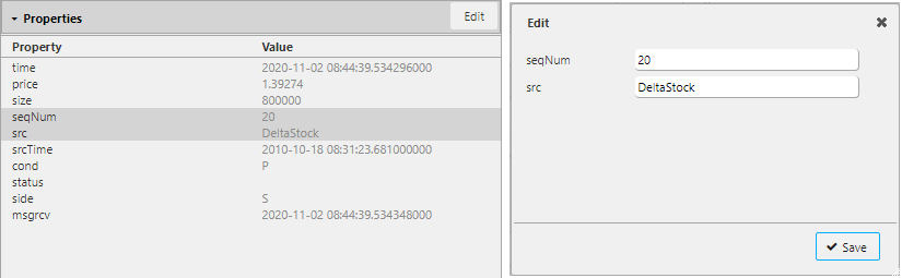
Action Type Cases
Users can create individual actions, which can be (optionally) associated/linked with other actions to form a case. Action creation requires Case Management in Basics to be enabled. The Case Management UI calls dxATCreateItem with 3 parameters, these are:
- The Action Tracker
- Action Tracker Parameter Dictionary.
-
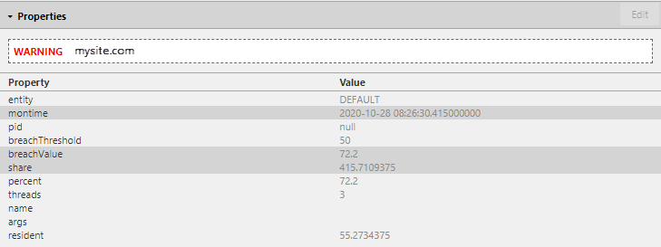
Action Tracker Payload Dictionary (i.e. any new columns added to the properties section)
Sample Dictionary Parameters
If the following parameters are specified in the UI: description, sym, alertkey, source, alertClass, tag1, tag2 and tag10, then the dictionary key will look like:
q
`sym`alertkey`source`description`alertClass`tag1`tag2`tag10
Create a Case
- Select available Action Type from dropdown. This is a list of available Action Trackers and is the only required parameter
Standard editable actions are: description sym alertkey source alertClass, but these are not required parameters.
- Add each supported Action Type for a case. More than one Action Tracker can be added
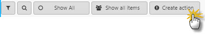
- Click
 to add an action
- Additional properties can be added to a case; added properties will appear in the case property panel.
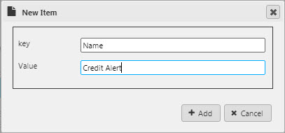
New column items are added to dxATAlert.
- Tags can be used and renamed in Dashboard Column Properties
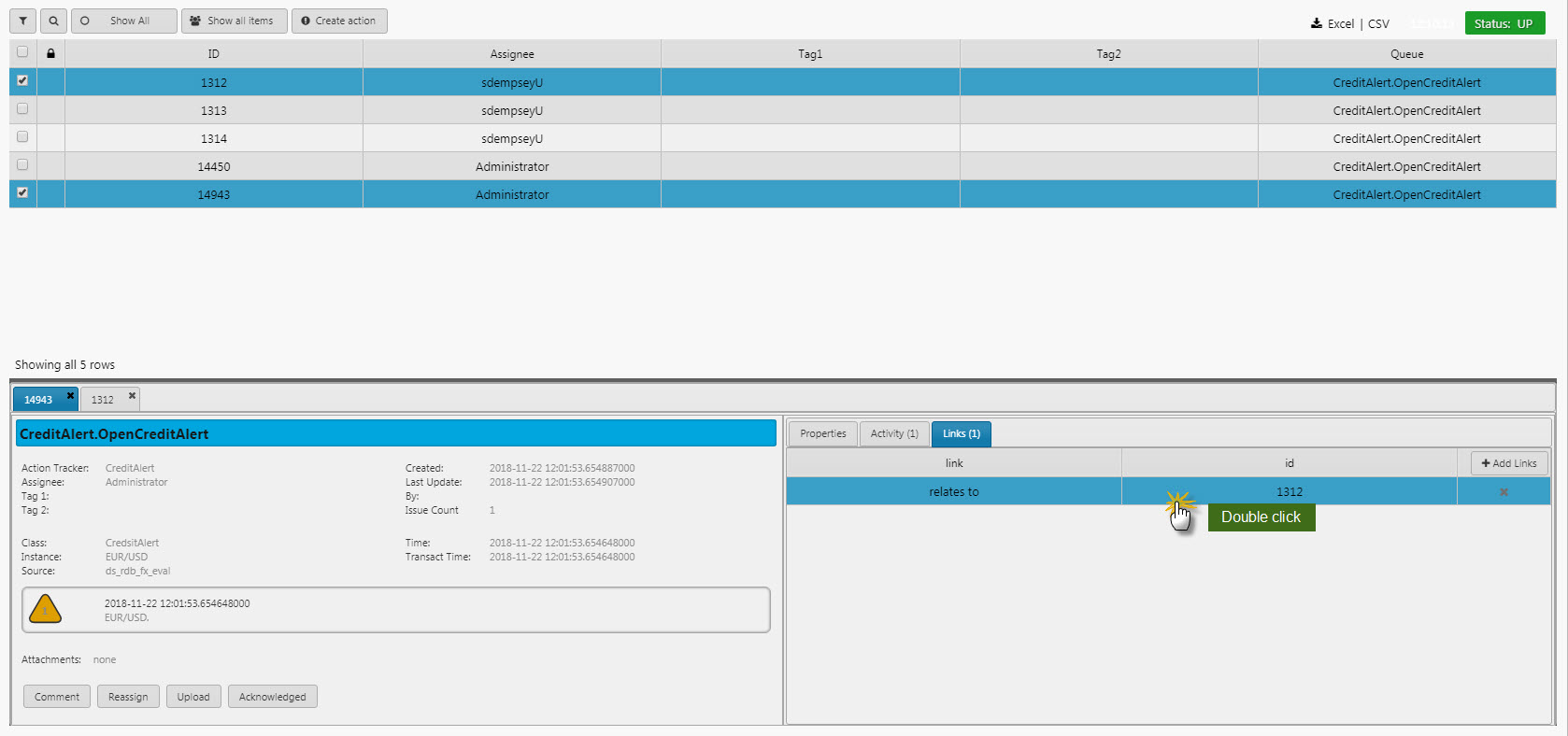
- View action (use filters if necessary); it will have it's own unique ID.
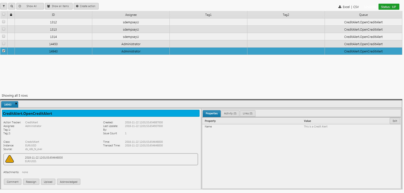
- An option to link the created action with other actions is available as a tab
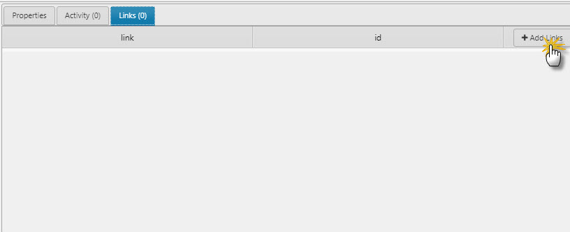
Linking Actions
Actions can only be linked when Case Management in Basics is enabled, otherwise this panel will be hidden.
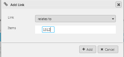
- When adding a link, select from Link type and Items (Action ID). Available link options are
relates to,derives to,is derived from,is dependent to,depends on,is blocked by,blocks,duplicates,is duplicated by
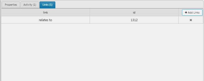
Linked actions can be viewed with a double-click. This will also open a tab for linked actions.
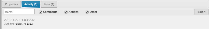
- All linking activity is recorded in the Activity tab
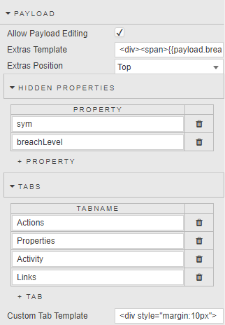
Payload
Configure the content and layout of the payload panel
- Allow Payload Editing
-
When checked, allows users to edit the details of the Alert:
- Extras Template
-
Apply HTML customizations with Handlebar helpers; for example:
<div><span>{{payload.breachLevel}}</span><span>{{payload.sym}}</span></div>-
- Extras Position
- Select from
Top,Bottom
Hidden Properties
- Properties to hide (hidden properties remain available in the template)
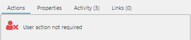
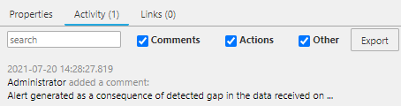
Tabs
- Configure which tabs are active and their order. Supported options are
Properties,Activity,Linksand one custom/user-defined tab. The first tab on the list is opened by default. - Custom Tab Template
-
Template for custom tab
Style, Format, Margins
- Alert Title Template
- Alert Title Templ. (Case)
- Alert Details Template
- Alert Details Templ. (Case)
- Alert Dialog Template
- Alert Dialog Templ. (Case)
- HTML Templates for Alert Title, Alert Details and Alert Dialog, and Handlebar helpers to map data into the template.
The Action Tracker has the following HandleBars helper function:
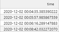
formatTimeStamps
Finds all kdb timestamps in a given string and converts them to a different format. If the date format parameter is omitted, the default conversion format is YYYY-MM-DD HH:mm:ss.SSSSSSSSS. The resulting value outputs the date and time based on the timezone setting in the Dashboard.
Parameters:
string{String}: The string containing kdb timestamps.date format{String}: Optional. The date format used for conversion. Refer to moment for available formats.
Returns {String}: The string containing the converted date formats
Example:
{{formatTimeStamps "Sample date: 2019.12.31D15:30:11.000000000" "MM-DD-YYYY HH:mm:ss.SS"}}
<!-- results in:  "Sample date: 12-31-2019 15:30:11.00" if timezone is set to UTC -->
<!-- results in:  "Sample date: 12-31-2019 10:30:11.00" if timezone is set to New York -->
<!-- results in:  "Sample date: 01-01-2020 00:30:11.00" if timezone is set to Tokyo -->
- Activity Character Limit
-
Specify character limit in activity logs record.
-
Style for common style settings
-
Templates for configuring property panels
Virus scanning
Files uploaded via the Upload component, and attachments uploaded via the Action Tracker, may be screened for viruses.
Two prerequisites for virus scanning:
- ClamAV installed on the appserver box with up-to-date definitions.
-
Virus scanning enabled in delta.profile as follows:
bash
DELTAAPPSERVER_VIRUS_SCAN_ENABLED=true
Restart the appserver to pick up any changes to the above environment variable.
Confirm virus scanning is enabled
Check the running Tomcat process:
bash
$ using ps -ef | grep tomcat
and look for
bash
-DdeltaAppServerVirusScanEnabled=true
or
bash
-DdeltaAppServerVirusScanEnabled=false
With virus scanning enabled, uploaded files will automatically be scanned and, if they fail the virus check, the upload is aborted and an error reported on the dashboard.